
Category: Web design
-
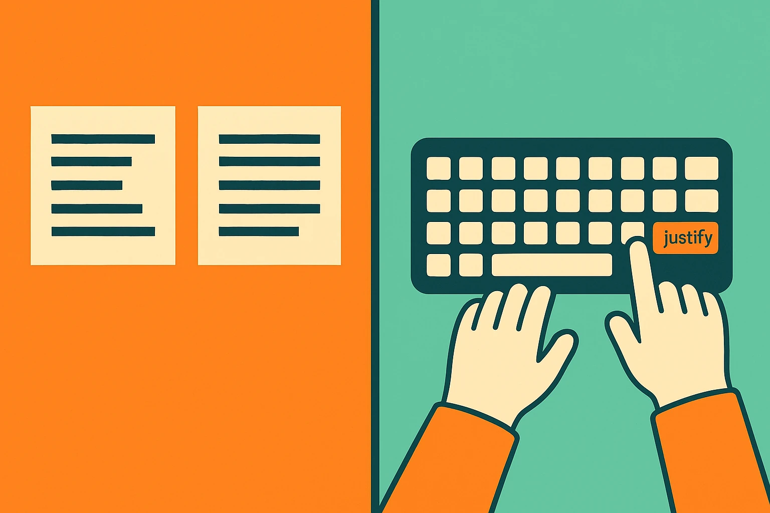
Justify text in WordPress
Do you want justified text in WordPress but the option seems gone? In this video tutorial my favorite method. In the article you will find other alternative solutions.
Written by
-
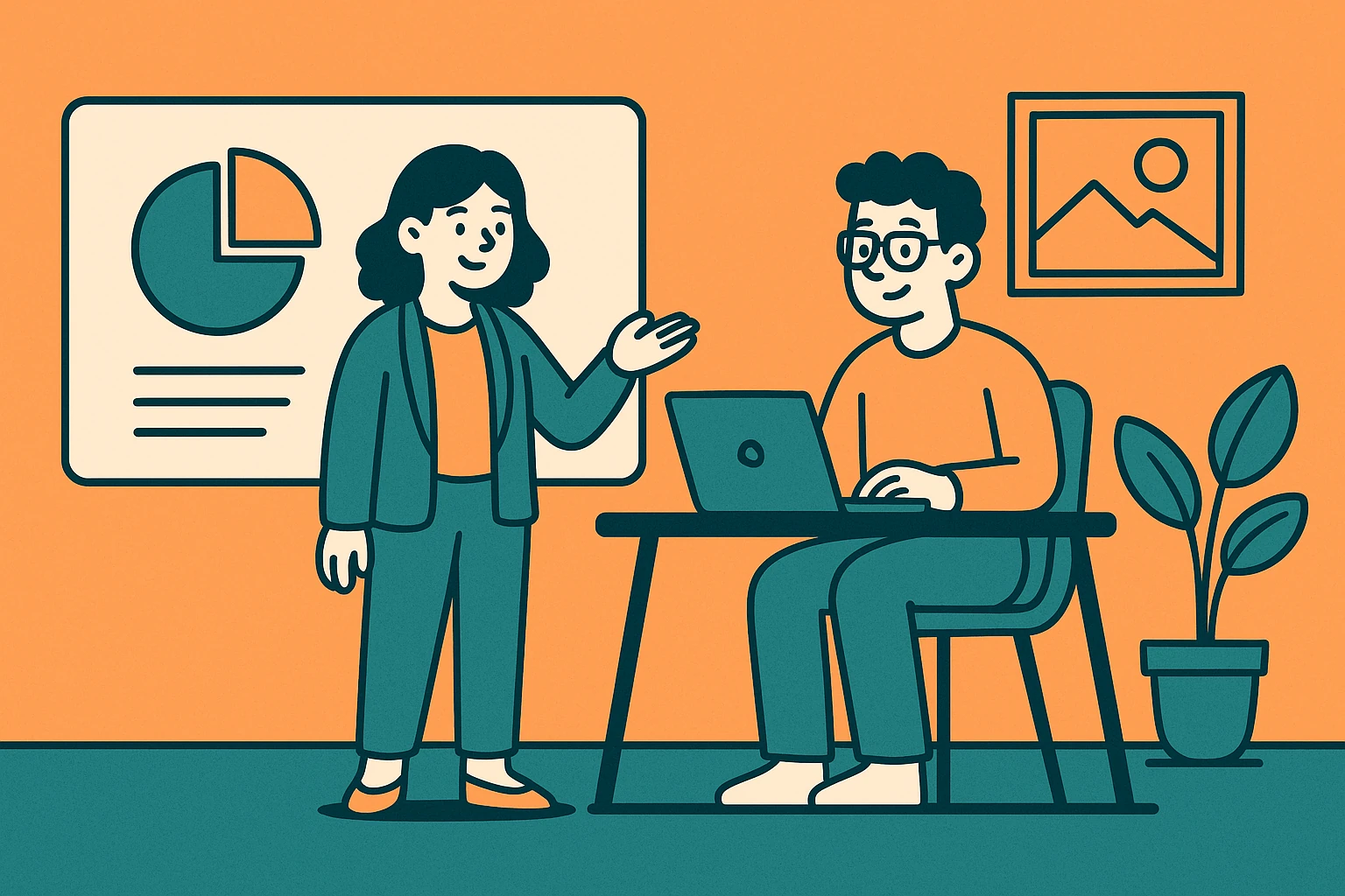
How to Write an Effective About Us Page
The About Us page is one of the most visited sections of any website—and one of the most underestimated. A compelling story, a human touch, and clear communication are all key to transforming a casual visitor into a potential client. In this article, you’ll discover how to write the About Us page, how to structure it, which visual elements to use, and…
Written by
-
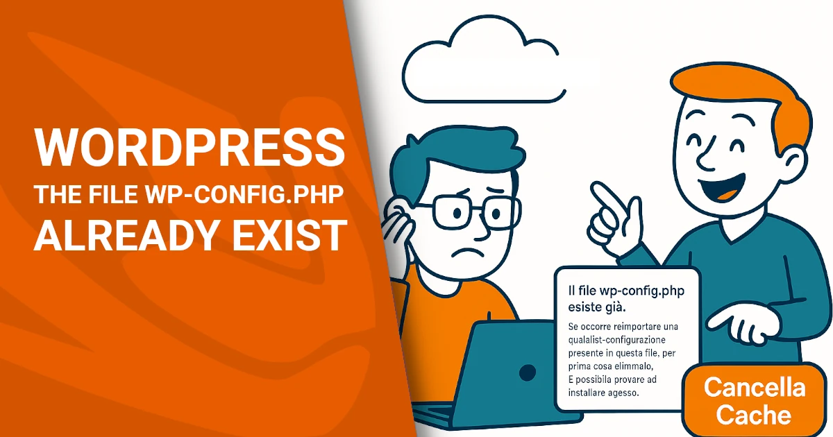
The file wp-config.php already exists? Clear Aruba cache
When WordPress works… but only on your computer You’ve just installed WordPress on a brand new domain. The backend works: plugins install, pages load, content saves, and everything seems just fine. But when you try to open the site from a smartphone or another device, an error message appears. Something like this: “The file wp-config.php already exists.…
Written by
-
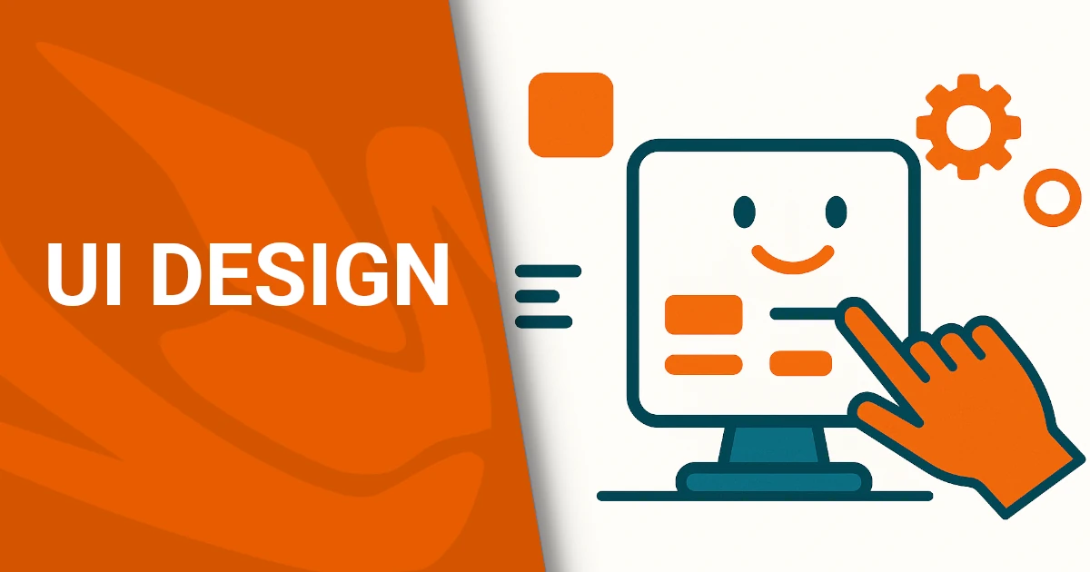
UI Design: cos’è e come si fa?
In this article, we’ll explore what User Interface Design (UI Design) is, why it’s crucial to the success of a digital product, and how it differs from User Experience Design (UX Design). We’ll also look at the fundamental principles of creating intuitive, accessible, and aesthetically pleasing interfaces. What is User Interface (UI) Design? (In-Depth with…
Written by
-
Digital accessibility: rule and value
Accessibility is not a one-time goal—it’s a continuous process. It takes awareness, ongoing updates, and a shared commitment.Dopstart supports you at every step: from the first audit to the final accessibility statement, offering a free initial consultation. Start today. Digital accessibility is now a real responsibility for all organizations working online, whether public or private. It’s not just…
Written by

-
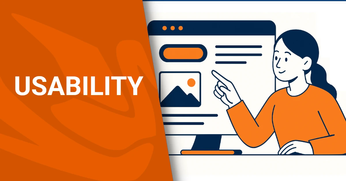
Digital usability and websites
Designing for usability means designing for people. Whether you’re creating an e-commerce platform or a municipal website, the goal is to make digital interaction easy, intuitive, and enjoyable. Dopstart offers expert support for businesses and institutions, from free initial consultation to the full design and testing of user-friendly digital platforms. Let’s create better web experiences—together. The success of a website or platform heavily…
Written by
-
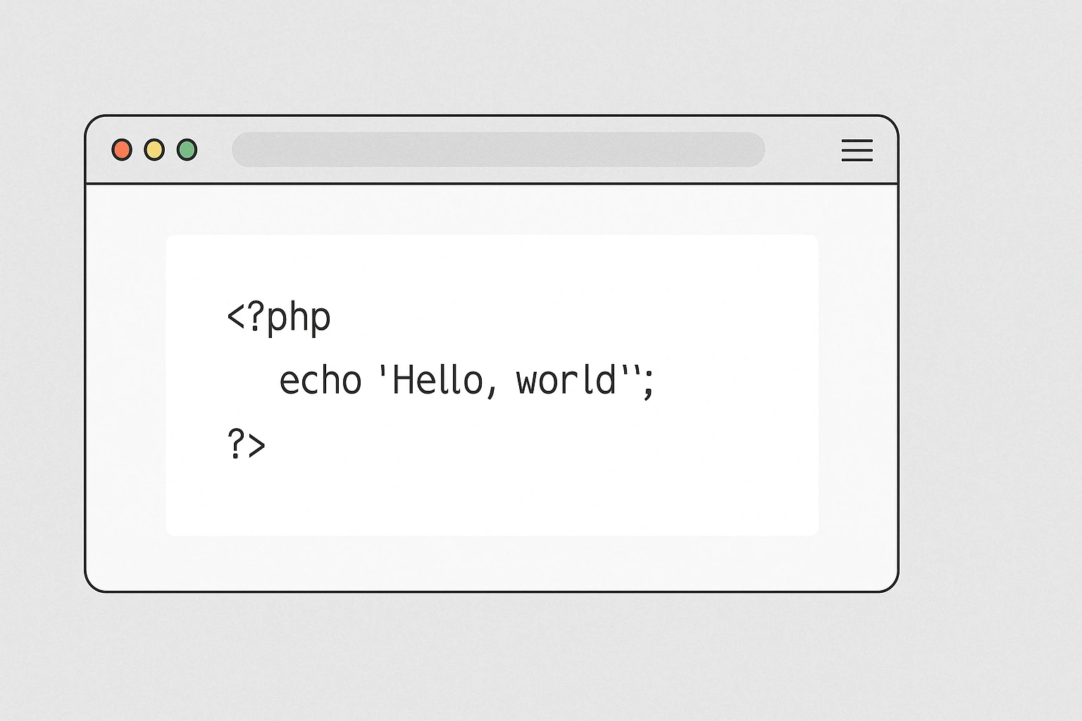
Add PHP Code to WordPress
Adding PHP code to WordPress pages can unlock advanced customization, integrate third-party tools, or display dynamic content. However, doing it the wrong way may compromise your website’s security or even break it. In this article, we’ll walk you through safe and effective methods to add PHP code to WordPress, even if you’re not a developer. Why WordPress…
Written by
-
Domain Problem Blogger Godaddy Without www
We have received several reports of problems with the Godaddy domain connected to Blogger. In this article we will see how to solve the problems between domain with www and without www on Blogger and GoDaddy in a simple and definitive way. Introduction One of the most common problems for people connecting a custom domain…
Written by

-
Creation of B&B (bed and breakfast) websites
A well-designed website is not just an online showcase, but an essential tool for attracting new customers and retaining existing ones. Investing money in the creation of bed and breakfast websites and digital marketing strategies means guaranteeing your accommodation facility a prosperous future. The goal is to get a steady flow of direct bookings and…
Written by