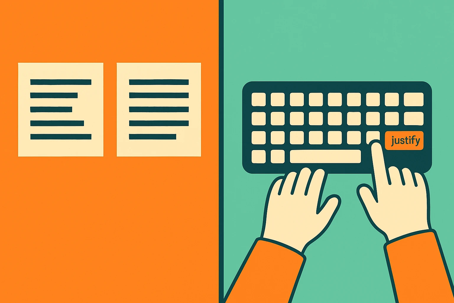
Do you want justified text in WordPress but the option seems gone?
In this video tutorial my favorite method. In the article you will find other alternative solutions.
(more…)
In this video tutorial my favorite method. In the article you will find other alternative solutions.
(more…)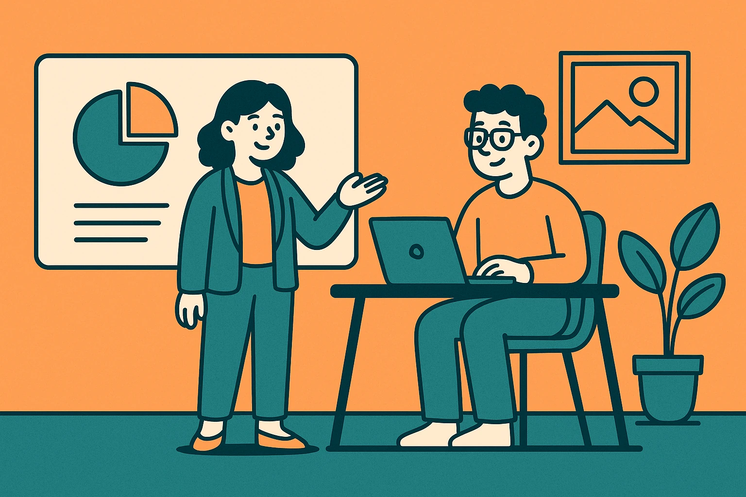
The About Us page is one of the most visited sections of any website—and one of the most underestimated. A compelling story, a human touch, and clear communication are all key to transforming a casual visitor into a potential client.
In this article, you’ll discover how to write the About Us page, how to structure it, which visual elements to use, and what makes the best About Us pages truly effective.
(more…)
You’ve just installed WordPress on a brand new domain. The backend works: plugins install, pages load, content saves, and everything seems just fine.
But when you try to open the site from a smartphone or another device, an error message appears. Something like this:
“The file wp-config.php already exists. If you need to reset any configuration in this file, delete it first. You can try to install now.“
Confused? You’re not alone. This was the issue faced on impresaindustria.it, and here’s what solved it.
When using Aruba hosting, the platform activates something called HiSpeed Cache by default. This server-side caching can sometimes store a “stuck” or broken version of your website — especially after a fresh installation.
That means even though your WordPress dashboard works perfectly, the public-facing site may appear broken or display strange installation messages.
Here’s how the issue was resolved in this real case:
Problem solved. The site became immediately visible from all devices.
After installing WordPress on Aruba, always clear the server cache before checking your site externally. Also, avoid relying only on your own browser – test your site from another network or device to make sure it’s accessible.
Having WordPress issues that don’t make sense? Dopstart offers a free initial consultation to help you diagnose and fix visibility and performance problems. From installation to SEO optimization, we’re your partner in the digital journey.
1. Why can I only see my WordPress site from one device?
Because of server-side caching. Your computer may show a cached version, while others get an error due to outdated or broken cache.
2. What does the wp-config.php error mean?
It usually means WordPress was already installed. But if the site works in the admin panel, the error is likely caused by cache issues rather than file problems.
3. What is Aruba’s HiSpeed Cache?
It’s a server-side caching system designed to speed up site loading. However, it can sometimes interfere with new installations if not cleared.
4. How do I clear the Aruba cache?
Log in to the Aruba control panel, go to the HiSpeed Cache section, and click “Cancella cache”.
5. Do I need to delete wp-config.php manually?
Not necessarily. If the site works in admin, the problem likely lies in the cache. Try clearing it first before deleting files.
6. Is this a common problem with Aruba hosting?
Yes, especially for users unfamiliar with Aruba’s default caching settings. It’s easily fixable once you know where to look.
7. Does clearing the cache delete any data?
No, it simply refreshes the cached version of the site. All your content and settings remain untouched.
8. Should I always clear the cache after installing WordPress?
It’s highly recommended when using hosting with server-side caching like Aruba, to ensure everything displays correctly.
9. Can this issue happen with other providers too?
Yes, any hosting with aggressive caching systems (like Varnish or Cloudflare) can present similar issues if cache isn’t purged.
10. Can Dopstart help with other WordPress issues too?
Absolutely. We assist with installations, migrations, performance optimization, SEO, and long-term digital strategy.
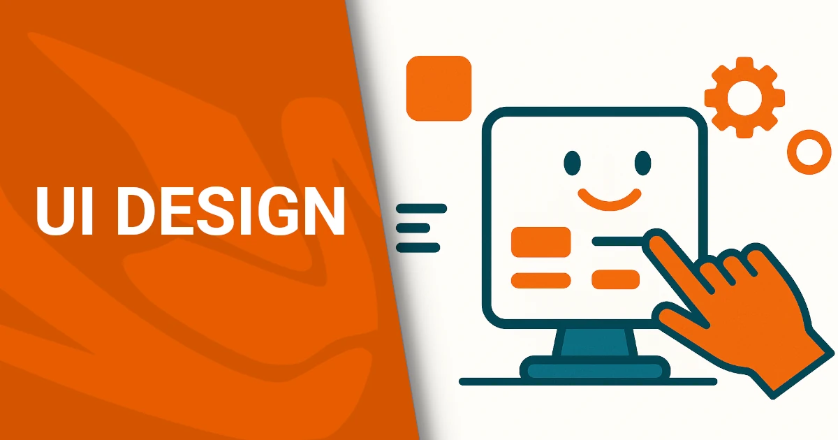
In this article, we’ll explore what User Interface Design (UI Design) is, why it’s crucial to the success of a digital product, and how it differs from User Experience Design (UX Design). We’ll also look at the fundamental principles of creating intuitive, accessible, and aesthetically pleasing interfaces.
User Interface (UI) Design is the process of designing interfaces through which users interact with digital products—such as websites, apps, voice assistants, or augmented reality systems.
The core goal is to combine functionality and visual appeal, ensuring that the interaction is intuitive, efficient, and even delightful. Good UI design isn’t just about how things look—it’s about making sure people can use them easilyand without confusion.
GUIs are the most common type of user interfaces. They include everything the user sees and touches: buttons, icons, sliders, menus, forms, and layout structures.
Practical Example – E-commerce Website:
Think of Zalando. The UI is clean, with a simple menu, large product images, and clearly defined call-to-action buttons like “Add to Cart.” A well-designed UI helps reduce cart abandonment and ensures the user finds what they’re looking for in just a few taps or clicks.
Practical Example – Mobile App:
On Instagram, the UI puts the content front and center. Only a few, intuitive buttons guide the experience. The heart icon for liking a post is positioned right where your thumb naturally rests—a classic example of mobile-first UI design.
VUIs let users interact using voice, often with no visible interface at all.
Practical Example – Smart Assistants:
When you say, “Hey Siri, turn on the lights in the kitchen,” the system interprets your command and responds. Even though there’s little to no visual feedback, the interface still exists—it’s in the way the system listens, processes, confirms, and acts. A great VUI design ensures the assistant understands natural speech and provides timely, accurate responses.
These interfaces let users interact via body movement, common in virtual or augmented reality.
Practical Example – Meta Quest (Oculus VR):
In Meta’s virtual environment, you can grab, swipe, or throw virtual objects using your hands. Designing for this space requires thinking in 3D: gestures must feel natural, actions must provide feedback (like vibrations or visual cues), and the system must minimize motion fatigue. This is UI design without buttons, but it’s still design in every sense.
A well-designed UI should almost disappear—not because it’s minimal, but because the user doesn’t have to think about how to use it. It just works.
Example – Domino’s Zero Click App:
Open the app, and your favorite pizza is ordered in seconds—no buttons, no forms. The interface is barely there, yet it delivers maximum usability by predicting what the user wants.
A strong UI Design:
If you’re wondering whether your interface is doing its job, Dopstart offers a free first consultation to help you evaluate and redesign your site or app for better clarity, usability, and engagement.
Would you like to continue with a dedicated section about how to test and improve your UI or go deeper into tools like Figma and Material UI?
UI and UX design are often used interchangeably, but they’re two distinct yet complementary disciplines essential in digital product design.
UX stands for User Experience Design. It covers the entire journey a user goes through when using a digital product—how it feels, how easily goals are achieved, and how satisfied the user is.
A UX designer focuses on:
UI stands for User Interface Design. It deals with the visual and interactive side of the experience—what users seeand touch.
A UI designer works on:
Think of a car:
A beautiful interface without usability is like a sports car with no steering wheel. But even the best driving logic won’t work if the controls are clunky or confusing.
In any good design team:
Together, they shape a seamless, engaging, and useful product.
Designing a great user interface means balancing functionality, clarity, and aesthetic consistency. First, know your audience: What are their goals? Are they tech-savvy? Do they have any disabilities or special needs?
Here are the key principles:
Keep interfaces simple and focused. Every element must serve a purpose. Eliminate clutter and distractions.
Example:
A login form with only essentials.
<form>
  <label for="email">Email</label>
  <input type="email" id="email" placeholder="Enter your email">

  <label for="password">Password</label>
  <input type="password" id="password" placeholder="Enter your password">

  <button type="submit">Log in</button>
</form>
Maintain consistent styling throughout the interface: colors, typography, button styles, spacing.
Example:
Your call-to-action button should always look the same.
button.cta {
  background-color: #FF6600;
  color: white;
  font-size: 18px;
  padding: 12px 20px;
  border-radius: 8px;
}Design for all users, including those with disabilities. Use proper contrast, semantic HTML, and keyboard support.
Example:
Accessible button with aria-label.
<button aria-label="Add to cart">
  <immagine carrello>
</button>
body {
  background-color: #fff;
  color: #111; /* Good contrast ratio */
}Interfaces must respond immediately to user input—hover effects, loading animations, confirmation messages.
Example:
A button reacts when clicked.
button:active {
  transform: scale(0.98);
  background-color: #cc5200;
}Use typography, spacing, and color to lead the eye and highlight the most important actions.
Example:
Hierarchy through font size and placement.
<h1>Discover Our Platform</h1>
<p class="subtitle">Faster, simpler, safer.</p>
<button class="cta">Get Started</button>
 {
  font-size: 32px;
  margin-bottom: 10px;
}
.subtitle {
  font-size: 18px;
  color: #666;
}One of the golden rules in User Interface Design is:
“Great design is invisible.”
An effective UI doesn’t draw attention to itself—it lets the user focus entirely on their task. When the interface becomes second nature, it disappears from the user’s awareness.
Invisible design is a philosophy that emphasizes effortless interaction. It reduces friction by making the interface intuitive, self-explanatory, and context-aware.
Users don’t need to learn how it works.
The system adapts to the user, not the other way around.
Every step feels natural, like second nature.
Domino’s Zero Click App is a brilliant real-life case.
Once set up, you just open the app and wait 10 seconds. Your default pizza gets ordered—automatically.
There are no visible interactions, no need to confirm or tap anything. That’s invisible UI: the app knows what you want and acts without asking.
In User Interface Design, we often focus on functionality, usability, and performance. But there’s one element that truly defines user loyalty and satisfaction: emotion.
Every user interaction with a digital product triggers an emotional response. That emotion—positive or negative—sticks with your brand.
A joyful experience → keeps users coming back
A frustrating one → pushes them away
Design isn’t just about what works. It’s about how it makes people feel.
Users forget what they clicked—but remember how they felt.
Designing for emotion is not decoration—it’s strategy.
In today’s digital landscape, users access websites and apps from phones, tablets, laptops, TVs, and even smartwatches. That’s why responsive and adaptive design are both essential.
Responsive design uses a single interface that flexibly adjusts to different screen sizes using CSS media queries, fluid grids, and scalable content.
Example:
An online store shows 4 items per row on desktop, 2 on tablet, and 1 on mobile. The HTML remains the same, but styles change according to the screen width.
.product {
  width: 25%;
}
@media (max-width: 768px) {
  .product {
    width: 50%;
  }
}
@media (max-width: 480px) {
  .product {
    width: 100%;
  }
}Adaptive design delivers distinct layouts based on the detected device or screen size.
It’s more device-specific, where the system loads different versions of the UI.
Example:
A travel booking app offers a complex desktop version and a simplified mobile version with touch-friendly buttons and linear navigation.
| Feature | Responsive Design | Adaptive Design |
|---|---|---|
| Technical approach | One flexible layout | Multiple tailored layouts |
| Screen adaptation | Fluid and dynamic | Predefined breakpoints |
| Development speed | Faster | More complex |
| Real-world example | WordPress websites | Airline or banking app |
em and %.In today’s digital landscape, users access websites and apps from phones, tablets, laptops, TVs, and even smartwatches. That’s why responsive and adaptive design are both essential.
Responsive design uses a single interface that flexibly adjusts to different screen sizes using CSS media queries, fluid grids, and scalable content.
Example:
An online store shows 4 items per row on desktop, 2 on tablet, and 1 on mobile. The HTML remains the same, but styles change according to the screen width.
cssCopiaModifica.product {
  width: 25%;
}
@media (max-width: 768px) {
  .product {
    width: 50%;
  }
}
@media (max-width: 480px) {
  .product {
    width: 100%;
  }
}
Adaptive design delivers distinct layouts based on the detected device or screen size.
It’s more device-specific, where the system loads different versions of the UI.
Example:
A travel booking app offers a complex desktop version and a simplified mobile version with touch-friendly buttons and linear navigation.
| Feature | Responsive Design | Adaptive Design |
|---|---|---|
| Technical approach | One flexible layout | Multiple tailored layouts |
| Screen adaptation | Fluid and dynamic | Predefined breakpoints |
| Development speed | Faster | More complex |
| Real-world example | WordPress websites | Airline or banking apps |
em and %.Designing an interface that works is not improvisation. If you are developing an app or a website, Dopstart offers an initial free consultation to analyze your project, identify critical issues and build a winning UI strategy together. We accompany you in all phases, from the idea to the launch.

Accessibility is not a one-time goal—it’s a continuous process. It takes awareness, ongoing updates, and a shared commitment.
Dopstart supports you at every step: from the first audit to the final accessibility statement, offering a free initial consultation. Start today.
Digital accessibility is now a real responsibility for all organizations working online, whether public or private. It’s not just about legal compliance, but about the desire to deliver inclusive, barrier-free digital experiences. Whether you’re a designer, developer, communication manager, or business owner, knowing how to start making your website accessible is the first step toward building a fairer digital space for everyone.
In this article, you’ll find clear guidance on obligations, best practices, tools, and resources to help you start building a strong and compliant accessibility strategy.
Digital accessibility refers to the ability of websites, apps, digital documents, and services to be usable by everyone, including people with permanent or temporary disabilities. It ensures that digital content can be perceived, understood, navigated, and interacted with by all users, regardless of physical or cognitive limitations.
Blind users rely on screen readers. Always provide meaningful alt text.
<img src="team-photo.jpg" alt="Team of Dopstart at work">
Form fields must be clearly labeled for accessibility.
<label for="name">Full Name</label>
<input type="text" id="name" name="name">
Ensure elements are keyboard-focusable. Use semantic elements or define roles properly.
<button onclick="submitForm()">Submit</button>
Or for custom buttons:
<div role="button" tabindex="0" onclick="openMenu()">Open Menu</div>
Use a minimum 4.5:1 contrast ratio for body text as per WCAG recommendations.
Not accessible:
color: #bbb;
background-color: #eee;
Accessible:
color: #000;
background-color: #ffffff;
The legal framework: The Stanca Law
Italy’s approach to digital accessibility is based on Law no. 4 of January 9, 2004, known as the Stanca Law. It requires all public sector websites and services to be accessible to people with disabilities.
Key principle:
“Everyone has the right to access digital public services, including persons with disabilities.”
AGID (Agency for Digital Italy) is responsible for:
The AGID Guidelines on accessibility are aligned with WCAG 2.1, and apply to:
Mandatory compliance in Italy: at least WCAG 2.1 level AA
All public entities must publish a digital accessibility statement which includes:
Example: https://form.agid.gov.it
To comply with AGID, attached documents must be accessible. An accessible PDF must:
Use tools like Adobe Acrobat Pro, LibreOffice, or Microsoft Word Accessibility Checker.
Until recently, digital accessibility was mostly considered a responsibility of public administrations. But since 2022, private companies have also come under specific legal obligations.
Following the EU Directive 2019/882, Italy implemented this regulation via Legislative Decree 82/2022. It extends digital accessibility obligations to large private companies offering essential public services online.
According to AGID’s Accessibility Guidelines for Private Entities, the following businesses are obligated:
Examples include:
These companies must:
Accessibility is now a legal requirement, not just a best practice.
This marks a turning point: digital accessibility becomes a part of corporate legal compliance, like data protection or cybersecurity.
Accessibility also:
An insurance provider over the revenue threshold must ensure:
AGID and Italian regulators can perform audits and apply administrative sanctions for:
If your business falls under these requirements—or you want to get ahead of the law—Dopstart offers a free consultation and full support in achieving technical and legal compliance.
Digital accessibility starts with inclusive design. It’s not just about complying with WCAG standards through code—it’s about thinking accessibly from the first wireframe.
Accessible interfaces:
1. Color contrast
Ensure text stands out clearly from its background.
CSS Example:
body {
  color: #000;
  background-color: #fff;
}


Aim for at least a 4.5:1 contrast ratio for body text.
2. Readable typography
Avoid small or overly stylized fonts. Stick to sans-serif fonts and ensure line height is adequate.
body {
  font-family: Helvetica, sans-serif;
  font-size: 16px;
  line-height: 1.6;
}
3. Logical structure and keyboard navigation
Design with semantic HTML and ensure users can navigate using the keyboard alone.
<header>...</header>
<nav>...</nav>
<main>...</main>
<footer>...</footer>
4. Clickable and clearly labeled buttons
Make sure all clickable areas are large enough and have clear labels.
<a href="/contact" class="button">Contact Us</a>
cssCopiaModifica.button {
  padding: 0.75rem 1.5rem;
  font-size: 1rem;
}
5. Visual and textual feedback
Users should receive immediate feedback on their actions, including form errors or successful submissions.
<p role="alert">Email is required.</p>
Italy’s AGID Design Guidelines for digital public services define:
Thinking inclusively pays off. It improves the user experience for everyone, reduces drop-off rates, enhances SEO, and builds trust in your brand.
In an increasingly digital world, excluding 20% of the population means missing out, ethically and economically. Ensuring web accessibility is not just a compliance issue—it’s a strategic move.
Making your website accessible isn’t a one-time task—it’s a continuous process of improvement. Whether building a new site or updating an existing one, digital accessibility starts with awareness, structure, and the right tools.
Start by identifying existing barriers:
Useful tools:
Check your website against WCAG 2.1, targeting Level AA for legal compliance.
Example:
<img src="banner.jpg" alt="Team of Dopstart working together">Avoid generic <div> and <span> for structure. Use:
<header>, <nav>, <main>, <section>, <footer>
Example:
<main>
  <section>
    <h1>About Us</h1>
    <p>Welcome to our website...</p>
  </section>
</main>
Make sure all elements are focusable and usable with the keyboard (Tab, Enter, Arrow keys).
<div role="button" tabindex="0" onclick="toggleMenu()">Open menu</div>
Label every input field clearly:
<label for="email">Email address</label>
<input type="email" id="email" name="email" required>Make sure your PDFs and other documents are:
If you’re a public organization or required by law, submit your accessibility statement on form.agid.gov.it.
Accessibility is a design culture. Educate your content creators, developers, and designers. Review accessibility regularly.
If your organization needs to improve its website’s web accessibility, Dopstart offers a free initial consultation. We support public and private entities through every step: audits, design, development, testing, and compliance verification with AGID accessibility guidelines. Get in touch to build a truly inclusive digital experience.
Ready to make your website more accessible and WCAG-compliant?
Download the Dopstart checklist, with all the key steps in Italian and English to start improving your site’s accessibility today.
1. What does digital accessibility mean?
The ability of websites, apps, and digital tools to be used by anyone, including those with disabilities.
2. What is the Stanca Law?
The Italian law that enforces digital accessibility for public sector websites.
3. Are private companies required to comply?
Yes, if they meet certain criteria and provide essential services digitally.
4. What are the WCAG levels?
Three levels: A, AA, AAA. Italian law requires level AA.
5. What is an accessibility statement?
A document outlining a site’s accessibility level and any non-compliant areas.
6. What is AGID’s role?
AGID sets the accessibility rules and monitors public website compliance.
7. How do you test a website for accessibility?
With automatic validators, manual checks, and assistive technology testing.
8. Is accessibility useful for everyone?
Absolutely—it benefits users with or without disabilities.
9. What’s the difference between accessibility and usability?
Accessibility is about inclusion; usability is about ease of use.
10. Can Dopstart help make my site accessible?
Yes, we provide full support, starting with a free consultation.
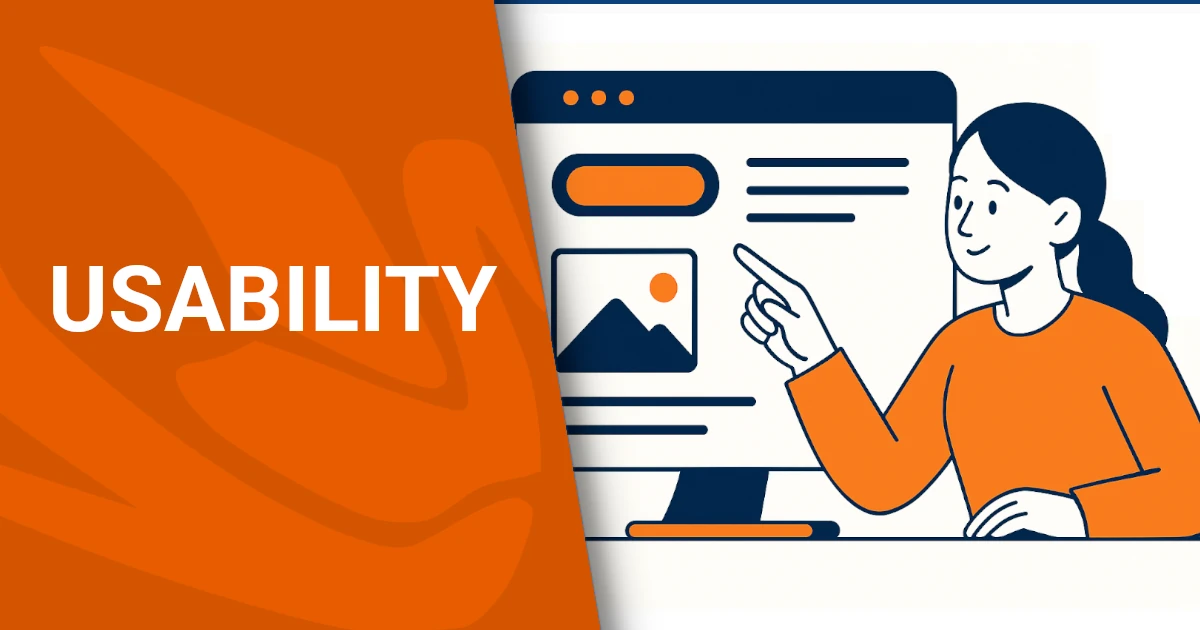
Designing for usability means designing for people. Whether you’re creating an e-commerce platform or a municipal website, the goal is to make digital interaction easy, intuitive, and enjoyable. Dopstart offers expert support for businesses and institutions, from free initial consultation to the full design and testing of user-friendly digital platforms. Let’s create better web experiences—together.
The success of a website or platform heavily depends on how usable it is. Usability—or usabilityin English—is not just a technical detail; it’s a key principle that impacts the overall user experience, how easily content can be accessed, and whether users achieve their goals. In this article, we explore the definition of usability, the standards that regulate it, how it applies to web design, and why it matters especially in the context of public administration.
Usability is defined as the degree to which a system is easy, efficient, and satisfying for users to interact with. It’s not just about visual appeal, but about how well the system supports user goals through clarity, consistency, and predictability.
According to the ISO 9241-11 standard, part of the broader ISO 9241 family on human-system interaction ergonomics, usability is:
“The extent to which a system, product or service can be used by specified users to achieve specified goals with effectiveness, efficiency and satisfaction in a specified context of use.”
Let’s break down the three key terms:
A beautiful interface is not necessarily usable. If users struggle to find information or complete tasks, the design has failed, regardless of how it looks.
Besides ISO 9241-11, these standards are also relevant:
The origins of usability
The idea of usability emerged from cognitive ergonomics, a field that studies the interaction between people and tools in order to optimize efficiency, safety, and comfort. Initially applied to industrial machinery, vehicle controls, and cockpit instruments, ergonomics evolved to include the human relationship with digital interfaces.
In the 1980s, with the spread of personal computers, usability began to be applied to software interfaces. As non-expert users began interacting with complex systems, it became essential to create tools that were intuitive and easy to learn. This led to the evolution of software usability, which further transitioned into web usability with the rise of the internet in the 1990s.
Web usability refers to designing websites and digital platforms that are:
A government website built with traditional ergonomic principles might include lots of information but organized poorly, with technical terms and confusing navigation. A site built with web usability in mind would include:
This shift from physical product design to web usability marks a broader transformation: we now design not only tools but user experiences. The quality of the interaction has become just as important as the system’s functionality.
A usable website is not just beautiful—it’s designed to be intuitive, efficient, consistent, and enjoyable for all users, regardless of their technical skills.
According to Jakob Nielsen, a website has good usability when it meets the following five key criteria:
New users should be able to understand quickly how to use the site and navigate it.
Example: a homepage with visible menus and logical navigation paths.
Once learned, the site should allow users to complete tasks quickly and effectively.
Example: an e-commerce site that lets users purchase in just 3 clicks.
Returning users should remember how to use the site without having to learn it again.
Example: a dashboard that maintains a consistent layout across sessions.
The system should prevent errors where possible, and help users recover easily from mistakes.
Example: a form that highlights errors and explains how to fix them.
The site should feel pleasant and fluid, and align with user expectations.
Example: quick page loads, clear calls-to-action, and friendly microinteractions.
Three distinct yet connected concepts
When designing effective digital products, it’s common to confuse usability, accessibility, and user experience (UX). While closely related, these terms describe different aspects of how users interact with technology. Understanding the differences is essential for creating user-centered websites and apps.
Usability is about how easy, efficient, and satisfying it is for a user to complete a specific task using a system. It focuses on learnability, consistency, error prevention, and task efficiency.
Example: A medical booking site that allows users to choose a doctor and schedule an appointment in 4 simple, clear steps.
Accessibility refers to whether a product can be used by people with disabilities—visual, auditory, motor, cognitive, or temporary impairments. It includes screen reader compatibility, keyboard navigation, alt text, proper color contrast, etc.
Example: An e-commerce site that allows a blind person using a screen reader to browse, select, and purchase a product independently.
User Experience (UX) is the overall impression a user has when interacting with a product—not only its functionality, but also its emotional and aesthetic impact. UX includes usability and accessibility, but also addresses design, tone of voice, trust, and brand identity.
Example: A banking app with a clean layout, smooth animations, friendly language, and a guided flow that makes the user feel in control and secure.
To summarize:
Accessibility = “Can I use it?”
Usability = “Is it easy to use?”
UX = “How do I feel about it?”
UWhy test usability?
A website or app may look perfect on paper, but only by observing real users in action can you verify if it’s truly usable. Usability testing is the key to discovering friction points, confusion, and areas for improvement.
During usability testing, we examine:
Real users are asked to perform tasks while being observed or recorded.
Methods:
Example: a 30-minute session with 5 users to test the mobile checkout experience.
Use tools like:
Example: users give opinions after using the site, pointing out confusing elements or moments of delight.
UX experts evaluate the interface using formal methods:
Example: an expert audit highlights poor button visibility, unclear labels, or inconsistent navigation.
Less common but useful during early design phases. Use computational models (e.g., GOMS, KLM) to simulate interactions.
Example: simulate the average time needed to complete a task on a prototype interface.
Consider:
Often, a hybrid strategy—combining user testing with expert reviews—yields the best results.
Usability testing should be:
As public services become increasingly digital, usability in public sector websites is essential to uphold the citizen’s right to access and information. Poorly designed government portals don’t just cause inconvenience—they risk excluding people, increasing bureaucracy and eroding public trust.
Public institutions must not stop at “publishing online”: they must make services truly usable and user-oriented. Citizens using these services are often under stress or time pressure. If the interface is slow, confusing, or broken, the digital service fails its purpose.
While there is no law that regulates usability per se, several regulations recognize its importance:
According to AGID guidelines, a public site should be:
Poor usability: a citizen wants to apply for a tax benefit, but the municipal website:
Good usability: the same service is available via:
Design for users, not for yourself
One of the most common mistakes in web design is assuming the user thinks like the developer. A usable website is built around real user needs, digital habits, and cognitive limits. User-Centered Design (UCD) is not just a philosophy—it’s a concrete, structured approach.
Define:
Use tools like Figma or Adobe XD to design user flows and interface layouts before coding.
Structure the site around user logic:
The visual layer should enhance—not distract from—the content.
Example of a usable HTML/CSS form:
<form>
  <label for="email">Email address</label>
  <input type="email" id="email" name="email" required placeholder="you@example.com">

  <label for="password">Password</label>
  <input type="password" id="password" name="password" required minlength="8">

  <button type="submit">Submit</button>
</form>
input, label, button {
  display: block;
  margin-bottom: 12px;
  font-size: 1rem;
}

input:invalid {
  border: 1px solid red;
}Test with real users before the site is live. Even testing with 5 users can uncover most major usability issues.
Usable websites use simple, direct, goal-oriented language.
Example:
A usable website must work well on all devices and load quickly. Use:
Design with accessibility standards (WCAG) in mind: screen reader support, keyboard navigation, color contrast, and visible focus states.e website is one where content, interface, navigation, and visual design all work together seamlessly.
Why invest in usability?
Creating a usable website, app, or digital platform isn’t just about aesthetics—it’s a strategic decision. A usable system brings tangible benefits to users, businesses, and public services alike.
Want to make sure your website is truly usable, effective, and user-centered?
Download the Dopstart checklist and review all the key elements of web usability step by step.
What is usability according to ISO 9241?
It’s the degree to which users can effectively, efficiently, and satisfactorily use a product in a given context.
What is the difference between usability and accessibility?
Accessibility addresses the needs of users with disabilities; usability ensures ease of use for everyone.
What makes a website usable?
Clarity, intuitive navigation, error tolerance, and user satisfaction are key indicators.
Who are the key experts on web usability?
Jacob Nielsen and Ben Shneiderman are two of the most influential figures in the field.
Why is usability important in public services?
It ensures fair and efficient access to digital services for all citizens.
How do you test a website’s usability?
Through real-user testing, expert reviews, interviews, and remote evaluations.
What are the benefits of improving usability?
Increased user satisfaction, fewer errors, better performance, and lower support costs.
Is usability only about design?
No, it also involves structure, content clarity, and how users interact with the system.
When should usability be assessed?
At every stage: design, development, and post-launch evaluations.
How can Dopstart help with usability?
We offer strategic and operational support, starting with a free consultation and guiding you through the entire usability process.
Would you like us to assess your website’s usability? Request your free consultation with Dopstart today.
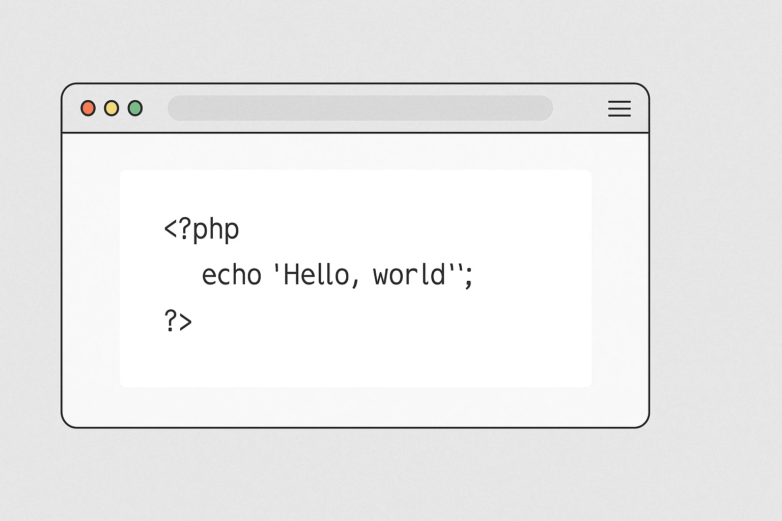
Adding PHP code to WordPress pages can unlock advanced customization, integrate third-party tools, or display dynamic content. However, doing it the wrong way may compromise your website’s security or even break it. In this article, we’ll walk you through safe and effective methods to add PHP code to WordPress, even if you’re not a developer.
For security reasons, WordPress does not allow direct execution of PHP code inside the page or post editor. This is to prevent any unauthorized or malicious user from injecting code that could compromise the entire site.
PHP has full access to the file system, database, and WordPress core functions. Therefore, executing unfiltered PHP can:
Imagine if someone inserts this code inside a page:
<?php
// DANGEROUS EXAMPLE – DO NOT USE
if (isset($_GET['delete_users']) && $_GET['delete_users'] == '1') {
    require_once(ABSPATH . 'wp-admin/includes/user.php');
    $users = get_users();
    foreach ($users as $user) {
        wp_delete_user($user->ID);
    }
    echo "All users have been deleted.";
}
?>
Then visits a URL like:
https://yoursite.com/page/?delete_users=1
The result? All users will be deleted from the site — a disaster.
Anything you write in the editor is treated as HTML or shortcode, but not executable code. This is intentional, to protect your site from malicious injections or accidental breakage.
If you need to use PHP in WordPress, use safe and controlled methods such as:
Developing a custom template file or widget
Creating a custom shortcode
Using plugins like Code Snippets
How to safely add PHP in WordPress
Since WordPress does not allow PHP execution directly within posts or pages, it’s essential to use safe, structured methods to customize your website without breaking it. Here’s how to do it the right way.
Code Snippets is a free and highly trusted plugin that lets you add custom PHP code safely through the dashboard.
function display_welcome_message() {
    echo "<p>Welcome to our website!</p>";
}
add_action('wp_footer', 'display_welcome_message');
This code will show a message in the footer of every page.
Shortcodes let you execute PHP logic inside posts or pages by typing a keyword in square brackets.
function current_date_shortcode() {
    return "Today is " . date('F j, Y');
}
add_shortcode('today_date', 'current_date_shortcode');
Insert this in functions.php (preferably in a child theme), and use [today_date] in your content.
functions.php (with care)If you’re comfortable editing your theme files, you can write PHP in functions.php. Always use a child theme to avoid losing changes after an update.
add_action('wp_head', function() {
    echo "<meta name='custom-meta' content='my-custom-value'>";
});
This code injects a custom meta tag into your site’s header.
Placing PHP code in the wrong places inside WordPress can lead to critical errors, broken pages, or security vulnerabilities. Let’s look at where you should never insert PHP.
WordPress does not process PHP inserted directly into the block or classic editor. It will either:
<?php echo "Hello world"; ?>
Result: you’ll see the raw code on the page or get a rendering error.
Default WordPress widgets support HTML and plain text, but not PHP. Inserting PHP there won’t work.
Use plugins like “PHP Code Widget” or “Code Snippets” to run PHP safely in widgets.
Never edit:
/wp-config.php/wp-settings.php/wp-includes/ or /wp-admin/Unless you’re an expert developer, editing these files is a major risk. Updates will override changes, and a single mistake can crash your site completely (white screen of death).
Editing a plugin’s code:
Instead, use hooks, filters, or create your own custom plugin to extend its behavior.
In widgets only if PHP execution is enabled
Inside the functions.php file of a child theme
Using the Code Snippets plugin
Through custom shortcodes
Inside custom templates
Besides the popular Code Snippets, there are several other safe and reliable plugins that allow you to add custom PHP code to WordPress without editing your theme files. These are great especially for non-developers.
Here are the top alternatives:
A powerful, flexible plugin that lets you:
Add this snippet:
add_action('wp_footer', function() {
    echo "<p style='text-align:center;'>Copyright © " . date('Y') . " - My Website</p>";
});
This will display a custom footer message.
Great if you want to create PHP-powered shortcodes you can reuse in pages, posts, or widgets.
Create a snippet named welcome:
echo "Welcome to our site!";
Then use the shortcode:
[xyz-ips snippet="welcome"]
This plugin allows you to add custom code to header, footer, body, or specific pages – all from the dashboard.
It’s easy to use and suitable even for simple PHP tasks.
Use these tools when:
You prefer to enable/disable code blocks with one click
You want to avoid editing theme files
You need conditional code placement
You want centralized snippet management
1. Can I insert PHP code directly into a WordPress page?
No, the editor does not execute PHP for security reasons. Use a shortcode or a plugin.
2. Is it safe to use a plugin for PHP?
Yes, as long as you use a reputable and updated plugin like Code Snippets.
3. Can I use PHP in the block editor (Gutenberg)?
No, the block editor does not interpret PHP code directly. Use a shortcode instead.
4. How do I create a custom PHP shortcode?
Write a function in functions.php and register it with add_shortcode().
5. What happens if I write PHP code incorrectly?
You could break your site. Always test code and make backups first.
6. Where can I test PHP code safely?
Use a local server (like XAMPP) or a sandbox plugin for safe testing.
7. Can I add PHP to a widget?
Yes, but you may need a plugin or to allow PHP execution in widgets manually.
8. Should I use functions.php or a plugin?
Plugins are safer and keep your changes even after theme updates.
9. How do I avoid losing custom code after a theme update?
Use a child theme or a plugin designed for custom code.
10. Can Dopstart help me with this?
Absolutely! We offer a free first consultation and custom support to implement PHP code safely and efficiently.

We have received several reports of problems with the Godaddy domain connected to Blogger. In this article we will see how to solve the problems between domain with www and without www on Blogger and GoDaddy in a simple and definitive way.
One of the most common problems for people connecting a custom domain to Blogger through a provider like GoDaddy is whether the site will work with and without www .
Often, in fact, you notice that the site opens perfectly with www , but that typing it without www shows a parking page, often from GoDaddy . In this article we analyze why this happens, how DNS configuration works and what you need to do to solve this annoying situation once and for all.
When you purchase a custom domain (e.g. yoursite.com ) and connect it to a platform like Blogger , it is important to know that www.yoursite.com and yoursite.com are considered two separate subdomains. The first is the so-called www subdomain , while the second is the naked domain . Both must be configured separately if you want them to lead to the same website.
Many users only set up the www subdomain on Blogger , leaving the domain bare with no clear instructions on where to point. This is why, when visiting yoursite.com , you are redirected to the typical parking page of GoDaddy , the domain provider.
To fix this, you need to work on your domain’s DNS records , which are the settings that tell browsers where to go when someone types in a certain address. In particular, it’s critical to add the correct A records to make your domain work without www .
Blogger uses four IP addresses to manage naked domains, which must be entered into the DNS panel of the provider (in this case, GoDaddy ). If these IPs are not present, the naked domain has nowhere to go and relies on GoDaddy’s default setting, which parks it.
tuosito.com)You will need to add four A records with the Name = @ (which indicates the domain without www), and as Value/IP Address these:
| Type | Name | Value (IP) |
|---|---|---|
| TO | @ | 216.239.32.21 |
| TO | @ | 216.239.34.21 |
| TO | @ | 216.239.36.21 |
| TO | @ | 216.239.38.21 |
If there are others with Name
@, delete them before entering these 4 (e.g. the ones pointing to GoDaddy or other IPs).
www.tuosito.com)It may take from a few minutes up to a few hours (max 24h) to see the effect.
Visitor types tuosito.com
→ A records take him to Blogger
→ Blogger automatically redirects towww.tuosito.com
Once you have properly configured your DNS records, it is essential to go into your Blogger settings and enable automatic redirection from your bare domain to www . This option, available in the “Publishing” section, ensures that anyone who types yoursite.com is automatically sent to www.yoursite.com , thus ensuring a consistent user experience and also improving your SEO positioning.
Without this setting, even with the correct DNS records, Blogger will not know how to handle traffic going to the non- www domain , causing errors or unpredictable behavior.
Once you have made all the changes, do not expect an immediate result. DNS changes take time to propagate across the Internet. Typically, it can take from a few minutes to 24 hours. It is normal for the site to continue to behave strangely in the meantime. The only thing to do is to be patient and check from time to time that everything is working as expected.
1. Why does my site only work with www?
Because you have only the www subdomain configured in DNS and not the naked domain.
2. What does naked domain mean?
It is the domain without the www prefix, for example yoursite.com.
3. Where do I enter the A records for Blogger?
In your provider’s DNS panel, in this case GoDaddy.
4. What are Blogger’s A records?
216.239.32.21, 216.239.34.21, 216.239.36.21, and 216.239.38.21.
5. What happens if I don’t set up a naked domain?
The domain points to the GoDaddy parking page or shows an error.
6. Should I delete other existing A records?
Yes, if there are A records pointing to other IPs, they should be removed.
7. Do I need to set up redirects on Blogger?
Absolutely, to avoid duplicate content and SEO issues.
8. How long does it take for DNS changes to take effect?
Up to 24 hours, but usually a few hours is enough.
9. Do I need a separate SSL certificate for my naked domain?
No, Blogger handles this automatically once it’s configured correctly.
10. Can I just use the bare domain without www?
Technically yes, but with Blogger it is recommended to always use www.

A well-designed website is not just an online showcase, but an essential tool for attracting new customers and retaining existing ones.
Investing money in the creation of bed and breakfast websites and digital marketing strategies means guaranteeing your accommodation facility a prosperous future.
The goal is to get a steady flow of direct bookings and a professional image that stands out from the competition.
DISCOVER OUR OFFER
All-inclusive B&B website 800€/month
The creation of websites for b&b is a job to be done with skill and experience. The necessary work is to conceive its project in order to obtain two effects:
Having a well-designed, professional website that is optimized for search engines can make the difference between a thriving B&B and one that struggles to get bookings.
In this article, we will analyze how to create a website for a bed and breakfast (or a vacation home) that is not only attractive, but also functional, mobile-friendly and able to satisfy the needs of each individual visitor.
The tourist who wants to book a Bed & Breakfast accommodation for his holidays wants to have a complete picture of the overnight experience he will have.
It is necessary to pay attention to the rooms and bathrooms, the two fundamental elements that can determine the positive choice by the user.
Furthermore, the contents must be accompanied by further information: these are the so-called details.
The questions that must be answered to the tourist are simple:
The more effectively you respond to all of your prospect’s objections, the more likely you are to receive favorable bookings.

LET’S TALK ABOUT YOUR BED & BREAKFAST WEBSITE!
Your new b&b website starts here
Creating a bed and breakfast website requires careful planning to answer all the questions potential guests may have.
It is essential to have a well-structured website to communicate professionalism and gain the trust of potential customers.
A B&B website must first of all be easy to navigate and offer clear and detailed information about its structure.
Here’s what’s important to consider when designing a website for a B&B.
A B&B website must include some essential features to be effective and competitive.
Here is the content you need to make your site one of the best bed and breakfast sites:
The creation of b&b websites cannot ignore search engine optimization (SEO). Our SEO agency’s effective strategy allows the site to appear in the first search results for relevant keywords, such as “bed and breakfast sites” or, with Local SEO “b&b in [name of the city]” or “b&b near [name of the city]“.
Among the best SEO solutions for a B&B we find:
Furthermore, the strategy should also consider the need to invest part of the budget in advertising actions through social media and other platforms.
| Price website b&b 2025 – Offer valid for 2025 |
|---|
| Design |
| Creation and online launch |
| Blog management with editorial plan and creation of articles with SEO copywriting |
| SEO promotion bed and breakfast website. |
| Hosting and maintenance |
| Price: €800 /month |
BLOCK IT AT THIS PRICE
Take advantage of it now!
The cost of a Bed and Breakfast (B&B) website can vary greatly depending on a variety of factors, including your specific needs, desired features, design complexity, SEO consulting, social media, etc.
Here are some general estimates to give you an idea of the possible costs:
Custom Web Development: We create a fully customized website with advanced features, such as an online booking system, a customized content management system, and a unique design.
Costs can vary greatly, but could start at €2,000 and easily exceed €10,000 or more, depending on the complexity of the project.
Recurring Costs: Remember that in addition to the initial cost of creating the website, you will also need to consider recurring costs, such as web hosting (which can range from €110 to over €300 per year), domain renewal, content updates, and ongoing SEO optimization.
Maintenance and Updates: Even after your website launches, you may need to invest in periodic maintenance and updates to ensure that your site remains up-to-date, secure, and functioning properly. These costs can vary depending on the needs of your B&B (average cost is $250 to $1,200 per year).
WHAT ARE YOU WAITING FOR?
Take advantage of it now!