
In this article, we’ll explore what User Interface Design (UI Design) is, why it’s crucial to the success of a digital product, and how it differs from User Experience Design (UX Design). We’ll also look at the fundamental principles of creating intuitive, accessible, and aesthetically pleasing interfaces.
Table of Contents
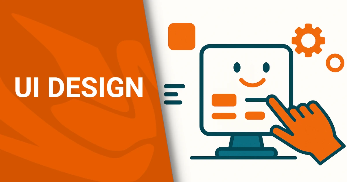
- What is User Interface (UI) Design? (In-Depth with Examples)
- UI vs UX Design: a Key Distinction
- How to Design an Effective Interface
- The Power of Invisible Design
- The Importance of Emotion in UI Design
- Responsive vs Adaptive Design
- Responsive vs Adaptive Design
- Why rely on Dopstart?
- Questions and Answers
What is User Interface (UI) Design? (In-Depth with Examples)
User Interface (UI) Design is the process of designing interfaces through which users interact with digital products—such as websites, apps, voice assistants, or augmented reality systems.
The core goal is to combine functionality and visual appeal, ensuring that the interaction is intuitive, efficient, and even delightful. Good UI design isn’t just about how things look—it’s about making sure people can use them easilyand without confusion.
Graphical User Interfaces (GUI)
GUIs are the most common type of user interfaces. They include everything the user sees and touches: buttons, icons, sliders, menus, forms, and layout structures.
Practical Example – E-commerce Website:
Think of Zalando. The UI is clean, with a simple menu, large product images, and clearly defined call-to-action buttons like “Add to Cart.” A well-designed UI helps reduce cart abandonment and ensures the user finds what they’re looking for in just a few taps or clicks.
Practical Example – Mobile App:
On Instagram, the UI puts the content front and center. Only a few, intuitive buttons guide the experience. The heart icon for liking a post is positioned right where your thumb naturally rests—a classic example of mobile-first UI design.
Voice-Based Interfaces (VUI)
VUIs let users interact using voice, often with no visible interface at all.
Practical Example – Smart Assistants:
When you say, “Hey Siri, turn on the lights in the kitchen,” the system interprets your command and responds. Even though there’s little to no visual feedback, the interface still exists—it’s in the way the system listens, processes, confirms, and acts. A great VUI design ensures the assistant understands natural speech and provides timely, accurate responses.
Gesture-Based Interfaces
These interfaces let users interact via body movement, common in virtual or augmented reality.
Practical Example – Meta Quest (Oculus VR):
In Meta’s virtual environment, you can grab, swipe, or throw virtual objects using your hands. Designing for this space requires thinking in 3D: gestures must feel natural, actions must provide feedback (like vibrations or visual cues), and the system must minimize motion fatigue. This is UI design without buttons, but it’s still design in every sense.
The “Invisible” UI Concept
A well-designed UI should almost disappear—not because it’s minimal, but because the user doesn’t have to think about how to use it. It just works.
Example – Domino’s Zero Click App:
Open the app, and your favorite pizza is ordered in seconds—no buttons, no forms. The interface is barely there, yet it delivers maximum usability by predicting what the user wants.
A strong UI Design:
- guides users without overwhelming them;
- anticipates user intent;
- reduces friction and cognitive load;
- reflects the brand’s identity visually;
- works seamlessly across devices (desktop, mobile, smartwatches, TVs, AR/VR platforms).
If you’re wondering whether your interface is doing its job, Dopstart offers a free first consultation to help you evaluate and redesign your site or app for better clarity, usability, and engagement.
Would you like to continue with a dedicated section about how to test and improve your UI or go deeper into tools like Figma and Material UI?
UI vs UX Design: a Key Distinction
UI and UX design are often used interchangeably, but they’re two distinct yet complementary disciplines essential in digital product design.
What is UX design?
UX stands for User Experience Design. It covers the entire journey a user goes through when using a digital product—how it feels, how easily goals are achieved, and how satisfied the user is.
A UX designer focuses on:
- mapping user needs through personas and user journeys;
- structuring flows and interactions;
- identifying friction points;
- running usability testing.
What is UI design?
UI stands for User Interface Design. It deals with the visual and interactive side of the experience—what users seeand touch.
A UI designer works on:
- color palettes, typography, spacing;
- buttons, icons, layout, and grids;
- interaction feedback (click, hover, swipe);
- maintaining visual consistency across the product.
The car metaphor
Think of a car:
- UX is the whole driving experience—from how comfortable the seat is, to how easy it is to park, to how safe you feel on the road.
- UI is the dashboard and controls—the steering wheel, pedals, gear stick, and how the interface communicates with you.
A beautiful interface without usability is like a sports car with no steering wheel. But even the best driving logic won’t work if the controls are clunky or confusing.
They work hand in hand
In any good design team:
- The UX designer defines the structure and strategy.
- The UI designer brings it to life visually.
Together, they shape a seamless, engaging, and useful product.
How to Design an Effective Interface
Designing a great user interface means balancing functionality, clarity, and aesthetic consistency. First, know your audience: What are their goals? Are they tech-savvy? Do they have any disabilities or special needs?
Here are the key principles:
1. Simplicity
Keep interfaces simple and focused. Every element must serve a purpose. Eliminate clutter and distractions.
Example:
A login form with only essentials.
<form>
  <label for="email">Email</label>
  <input type="email" id="email" placeholder="Enter your email">

  <label for="password">Password</label>
  <input type="password" id="password" placeholder="Enter your password">

  <button type="submit">Log in</button>
</form>
2. Consistency
Maintain consistent styling throughout the interface: colors, typography, button styles, spacing.
Example:
Your call-to-action button should always look the same.
button.cta {
  background-color: #FF6600;
  color: white;
  font-size: 18px;
  padding: 12px 20px;
  border-radius: 8px;
}
3. Accessibility
Design for all users, including those with disabilities. Use proper contrast, semantic HTML, and keyboard support.
Example:
Accessible button with aria-label.
<button aria-label="Add to cart">
  <immagine carrello>
</button>
body {
  background-color: #fff;
  color: #111; /* Good contrast ratio */
}
4. Instant Feedback
Interfaces must respond immediately to user input—hover effects, loading animations, confirmation messages.
Example:
A button reacts when clicked.
button:active {
  transform: scale(0.98);
  background-color: #cc5200;
}
5. Visual Hierarchy
Use typography, spacing, and color to lead the eye and highlight the most important actions.
Example:
Hierarchy through font size and placement.
<h1>Discover Our Platform</h1>
<p class="subtitle">Faster, simpler, safer.</p>
<button class="cta">Get Started</button>
 {
  font-size: 32px;
  margin-bottom: 10px;
}
.subtitle {
  font-size: 18px;
  color: #666;
}
The Power of Invisible Design
One of the golden rules in User Interface Design is:
“Great design is invisible.”
An effective UI doesn’t draw attention to itself—it lets the user focus entirely on their task. When the interface becomes second nature, it disappears from the user’s awareness.
What is invisible design?
Invisible design is a philosophy that emphasizes effortless interaction. It reduces friction by making the interface intuitive, self-explanatory, and context-aware.
Users don’t need to learn how it works.
The system adapts to the user, not the other way around.
Every step feels natural, like second nature.
Real-world example: Domino’s Zero Click App
Domino’s Zero Click App is a brilliant real-life case.
Once set up, you just open the app and wait 10 seconds. Your default pizza gets ordered—automatically.
There are no visible interactions, no need to confirm or tap anything. That’s invisible UI: the app knows what you want and acts without asking.
More examples of invisible design
- Smart autocomplete in search engines: it predicts what you’ll type.
- Auto-save in Google Docs: you don’t even notice it saving, but it never loses a word.
- Swipe gestures in Gmail app: no explanation needed, just swipe to archive.
How to create an invisible interface
- Use familiar icons and patterns that don’t need explanation.
- Cut out unnecessary steps.
- Provide discreet feedback (e.g., subtle animations, gentle haptic feedback).
- Anticipate user needs with smart defaults and predictive actions.
- Maintain design consistency across platforms and screens.
The Importance of Emotion in UI Design
In User Interface Design, we often focus on functionality, usability, and performance. But there’s one element that truly defines user loyalty and satisfaction: emotion.
Interfaces speak to emotion
Every user interaction with a digital product triggers an emotional response. That emotion—positive or negative—sticks with your brand.
A joyful experience → keeps users coming back
A frustrating one → pushes them away
Design isn’t just about what works. It’s about how it makes people feel.
Emotional design in action
- Duolingo uses animations and encouraging phrases: “You’re a star!” → users smile and feel accomplished.
- Spotify suggests playlists like “Your 2024 Summer” → nostalgia and personal relevance.
- Airbnb shows warm photos with phrases like “Feel at home, anywhere” → comfort and trust.
How to design for emotion
- Use friendly microcopy instead of cold error codes (e.g., “Oops! Let’s try that again”).
- Add subtle animations or illustrations to humanize the interface.
- Choose colors and fonts that match your emotional tone (e.g., warm = friendly, dark blue = trust).
- Provide visual rewards for positive actions (e.g., confetti animation after completing a task).
Remember
Users forget what they clicked—but remember how they felt.
Designing for emotion is not decoration—it’s strategy.
Responsive vs Adaptive Design
In today’s digital landscape, users access websites and apps from phones, tablets, laptops, TVs, and even smartwatches. That’s why responsive and adaptive design are both essential.
What is responsive design?
Responsive design uses a single interface that flexibly adjusts to different screen sizes using CSS media queries, fluid grids, and scalable content.
Example:
An online store shows 4 items per row on desktop, 2 on tablet, and 1 on mobile. The HTML remains the same, but styles change according to the screen width.
.product {
  width: 25%;
}
@media (max-width: 768px) {
  .product {
    width: 50%;
  }
}
@media (max-width: 480px) {
  .product {
    width: 100%;
  }
}
What is adaptive design?
Adaptive design delivers distinct layouts based on the detected device or screen size.
It’s more device-specific, where the system loads different versions of the UI.
Example:
A travel booking app offers a complex desktop version and a simplified mobile version with touch-friendly buttons and linear navigation.
Key differences
| Feature | Responsive Design | Adaptive Design |
|---|---|---|
| Technical approach | One flexible layout | Multiple tailored layouts |
| Screen adaptation | Fluid and dynamic | Predefined breakpoints |
| Development speed | Faster | More complex |
| Real-world example | WordPress websites | Airline or banking app |
Best practices
- Design mobile-first, then scale up.
- Use relative units like
emand%. - Apply strategic breakpoints (480px, 768px, etc).
- Ensure buttons are tap-friendly.
- Test on real devices, not just emulators.
Responsive vs Adaptive Design
In today’s digital landscape, users access websites and apps from phones, tablets, laptops, TVs, and even smartwatches. That’s why responsive and adaptive design are both essential.
What is responsive design?
Responsive design uses a single interface that flexibly adjusts to different screen sizes using CSS media queries, fluid grids, and scalable content.
Example:
An online store shows 4 items per row on desktop, 2 on tablet, and 1 on mobile. The HTML remains the same, but styles change according to the screen width.
cssCopiaModifica.product {
  width: 25%;
}
@media (max-width: 768px) {
  .product {
    width: 50%;
  }
}
@media (max-width: 480px) {
  .product {
    width: 100%;
  }
}
What is adaptive design?
Adaptive design delivers distinct layouts based on the detected device or screen size.
It’s more device-specific, where the system loads different versions of the UI.
Example:
A travel booking app offers a complex desktop version and a simplified mobile version with touch-friendly buttons and linear navigation.
Key differences
| Feature | Responsive Design | Adaptive Design |
|---|---|---|
| Technical approach | One flexible layout | Multiple tailored layouts |
| Screen adaptation | Fluid and dynamic | Predefined breakpoints |
| Development speed | Faster | More complex |
| Real-world example | WordPress websites | Airline or banking apps |
Best practices
- Test on real devices, not just emulators.
- Design mobile-first, then scale up.
- Use relative units like
emand%. - Apply strategic breakpoints (480px, 768px, etc).
- Ensure buttons are tap-friendly.
Why rely on Dopstart?
Designing an interface that works is not improvisation. If you are developing an app or a website, Dopstart offers an initial free consultation to analyze your project, identify critical issues and build a winning UI strategy together. We accompany you in all phases, from the idea to the launch.
Questions and Answers
- What is UI design? It is the design of the user interface for software, apps and digital devices.
- What is the difference between UI and UX? UI is about the visual aspect and interaction, UX is the entire user experience.
- Do you need to know how to code to do UI design? Not necessarily, but knowing HTML and CSS is a plus.
- What tools does a UI designer use ? Figma, Sketch, Adobe XD, InVision, among others.
- How much does a UI designer earn? In the US the average salary is over $75,000 a year.
- Is UI design suitable for beginners? Yes, with practice and study you can start even as a self-taught.
- What are the basic principles of UI design? Simplicity, consistency, accessibility, feedback and visual hierarchy.
- How can I improve in UI design? Practice, study, get feedback and take specialized courses.
- Are there any interfaces that are not graphical? Yes, voice and gestures are examples of non-graphical UIs.
- What makes an interface effective? Being easy to use, intuitive and visually pleasing.
Sign up for the newsletter. Stay updated!
We will send you periodical important communications and news about the digital world. You can unsubscribe at any time by clicking the appropriate link at the bottom of the newsletter.
Leave a Reply