Author: Dopstart

  • Google SERP Volatility Spikes – May 2025

    Google SERP Volatility Spikes – May 2025

    After weeks of relative calm, Google Search rankings saw a significant spike in volatility on May 8, 2025, initially in the United States and then spreading to Italy on May 9. In this article, we break down what’s happening in the SERPs using data from tools like Semrush, and explain what it means for your SEO strategy right now.

    Table of Contents

    May 8: SERP volatility hits the US

    On May 8, SEO tracking tools and industry chatter began lighting up due to sudden ranking fluctuations in the US search results. Although Google has not officially confirmed any algorithm update, the data and anecdotal evidence suggest otherwise.

    This is the most significant movement since the March 2025 Core Update, which remains the only confirmed update of the year so far. With no word from Google, this points to potential stealth rolloutsAI testing like Search Generative Experience (SGE), or other behind-the-scenes adjustments.

    Volatilità USA 8 maggio 2025 (SemRush Sensor)
    Volatilità USA 8 maggio 2025 (SemRush Sensor)

    May 9: High volatility reaches Italy

    Just 24 hours later, on May 9, a similar pattern emerged in Italy, where Semrush Sensor recorded a volatility score of 9/10 — a level typically seen during confirmed algorithm updates.

    An analysis of the SERP feature occurrences in the top 20 results shows notable shifts:

    • Related searches: 93.04% of SERPs (+0.48)
    • Sitelinks: 52.74%, slightly down (-0.11)
    • Image packs: 43.61%, sharp increase (+1.17)
    • Images: 39.53%, dropped significantly (-0.26)
    • Videos: 29.61%, strong growth (+0.87)
    • People Also Ask: 66.84%, decreased (-0.47)
    • Shopping Ads: 7.88%, large increase (+4.18)

    These changes point to a visually enriched and commerce-driven SERP, likely favoring content with media elements(images, videos) and optimized product listings. The data suggests Google is recalibrating its SERP features in real time — and the SEO implications are major.

    Volatilità Italia 9 maggio 2025 (SemRush Sensor)
    Volatilità Italia 9 maggio 2025 (SemRush Sensor)

    What this means for your SEO

    For websites, these movements can cause sudden ranking losses or gains — especially if your content lacks multimedia elements or structured data. Google is clearly leaning toward interactive, user-focused results that align with E-E-A-T principles (Experience, Expertise, Authoritativeness, Trustworthiness).

    To adapt quickly:

    • Review your keyword positions and traffic in GA4 and Search Console
    • Check which SERP features are active for your niche
    • Ensure your pages contain relevant visual and structured content

    Partner with Dopstart for expert SEO guidance

    Navigating unpredictable SERP behavior isn’t easy — that’s why Dopstart offers a free SEO consultation to evaluate your current situation. We can help you understand the impact of this May 2025 volatility, and guide you through a tailored strategy to strengthen your digital presence.

    FAQ

    1. What caused the May 8 SERP volatility?
    Unconfirmed changes by Google, likely related to algorithm tweaks or AI feature testing.

    2. Did the volatility affect Italy too?
    Yes, by May 9 the volatility score in Italy hit 9/10 on Semrush Sensor.

    3. Which SERP features are increasing?
    Image packs, videos, related searches, and shopping ads saw significant gains.

    4. How should I respond to ranking drops?
    Avoid knee-jerk reactions. Monitor data, analyze trends, and focus on content quality and diversity.

    5. Has Google confirmed a new algorithm update?
    No, but the data indicates significant changes are underway.

    6. Can GA4 bugs affect traffic data?
    Yes, but only in reporting — rankings themselves are unaffected.

    7. What does a 9/10 Semrush volatility score mean?
    It indicates extreme ranking fluctuations, similar to those seen during official updates.

    8. What are SERP features?
    Additional elements in search results, like videos, images, carousels, and shopping ads.

    9. Are visual elements now critical for SEO?
    Yes, especially with image packs and videos gaining prominence in the SERPs.

    10. How can Dopstart help my business?
    We provide tailored SEO support, detailed analysis, and ongoing guidance — starting with a free consultation.

    Worried about May’s ranking shakeup?
    Contact Dopstart today for a free SEO assessment and personalized support.

  • Google’s Gemini AI now open to kids under 13 – but experts raise red flags

    Google’s Gemini AI now open to kids under 13 – but experts raise red flags

    Parental controls and educational promises meet growing fears over privacy and mental health risks for children. Gemini for kids may sound like progress, but the balance between educational support and safeguarding mental well-being is fragile. The AI-child relationship deserves a closer look — before it’s too late.

    A kid-friendly AI?

    Google has opened access to its Gemini chatbot to users under the age of 13, provided they are supervised through Family Link, the company’s parental control system. The move, aimed at expanding its user base, enters a delicate field filled with both educational potential and psychological hazards.

    In an email to parents, Google claims Gemini will help children ask questionsget homework help, and invent stories. Parents will be notified at the child’s first login and can adjust or block access.

    Red flags from researchers

    Despite Google’s assurance of stronger filters, experts warn that kids may still encounter inappropriate content. Google advises against sharing sensitive data and reminds users that “Gemini is not human”.

    According to Oxford psychologist Karen Mansfield, AI that mimics human behavior could impact children’s mental health more than social media. And Unicef warns that generative AI can mislead, confuse, or manipulate young minds.

    An aggressive growth move?

    Allowing kids to access Gemini is a clear attempt to boost adoption of Google’s AI tool, as Big Tech races for AI supremacy. But the consequences could be dire.

    Common Sense Media reports that AI chatbots may encourage harmful behavior and worsen mental health issues. Meanwhile, Meta AI is already under scrutiny for sexually inappropriate conversations with minors.

    Privacy laws in the spotlight

    Google claims children’s data won’t be used to train AI models and that its move complies with the Children’s Online Privacy Protection Act (COPPA). But after previous fines for privacy violations, skepticism remains.

    Digital Marketer Donato Paolino criticizes the move, arguing kids shouldn’t even have smartphones based on pediatric research highlighting their negative impact on healthy development.

  • How to Rank in Google AI Overviews

    How to Rank in Google AI Overviews

    Ranking in AI Overviews is not guaranteed, but by aligning your content with SEO strategies, enhancing user experience, and embracing structured data and E-E-A-T, you can significantly improve your visibility across search engines. The evolution of AI in search demands a proactive, quality-driven approach to content creation and optimization.

    With the introduction of Google’s AI Overview, search engine optimization (SEO) is entering a new era. This feature, powered by generative AI, offers summarized answers at the top of the results page, reshaping the way search engines display information. To secure a position in these overviews, websites need to adapt their content and technical SEO practices. This article explores how to optimize for this emerging layer of search, enhancing your chances of ranking in AI-driven summaries.

    Table of Contents

    What is Google’s AI Overview?

    Google’s AI Overview is a generative AI feature that provides synthesized responses to a search query directly in the results page. Unlike traditional organic search results, these summaries pull data from various sources and present it in a concise, readable format. It often appears above featured snippets, drastically increasing visibility for those selected.

    This shift means search engine optimization (SEO) must now go beyond traditional ranking goals to address AI-generated content formats.

    The role of generative AI in search engines

    Generative AI processes and synthesizes large volumes of information to generate natural-sounding responses. In Google Search, it selects trustworthy content to construct AI Overviews that align with user experience preferences—clarity, authority, and speed.

    To compete for a place in these results, your content must be optimized not just for relevance, but also for experience, expertise, and authoritativeness—three pillars of Google’s E-E-A-T principles.

    SEO strategies for ranking in AI Overviews (with examples)

    Google’s AI Overviews rely on generative AI to compile quick, informative summaries. To improve your ranking in AI, apply targeted SEO strategies combining technical optimization with smart content structure.

    1. Use structured data

    Structured data helps search engines interpret your content correctly. Use JSON-LD to markup FAQs, articles, or product details.

    Example – FAQ structured data:

    <script type="application/ld+json">
    {
    "@context": "https://schema.org",
    "@type": "FAQPage",
    "mainEntity": [{
    "@type": "Question",
    "name": "What is an AI Overview in Google?",
    "acceptedAnswer": {
    "@type": "Answer",
    "text": "AI Overviews are generative AI-powered summaries that provide users with quick answers using information from multiple sources."
    }
    }]
    }
    </script>

    2. Focus on conversational search queries

    AI Overviews respond to natural-language queries like:

    • “How to improve SEO in 2025?”
    • “What is structured data in SEO?”

    Optimize your H2s and page content to reflect these long-tail, user-intent-driven phrases.

    3. Write concise and direct answers

    Answers selected for Overviews often resemble featured snippets. Keep them under 3–4 sentences, objective and informative.

    Example:
    “Structured data is a standardized format that helps search engines understand the context of a web page.”

    Avoid long intros, fluff, or ambiguity.

    AI Overviews appear mostly for informational searches. Identify your user’s intent and create targeted content that addresses it directly.

    Use Google’s “People also ask” and Search Console to spot these opportunities.

    5. Use bullet points and summaries

    Organized, scannable content is easier for Google to summarize. Bullet lists are ideal for step-by-step or benefits breakdowns.

    Example:

    <ul>
    <li>Implement structured data</li>
    <li>Target long-tail keywords</li>
    <li>Improve mobile usability</li>
    </ul>

    6. Optimize for mobile & performance

    User experience matters for AI selection. Ensure your site:

    • Loads in under 2.5s
    • Passes Core Web Vitals
    • Has responsive design

    Use Google PageSpeed Insights to identify and fix performance issues.

    7. Monitor with Google Search Console

    Use GSC to:

    • Track which search queries bring traffic
    • Identify underperforming pages
    • Discover indexing or rendering issues

    Update content accordingly to match what users are really searching for.

    E-E-A-T and its impact on AI ranking

    Google’s evaluation of Experience, Expertise, Authoritativeness, and Trustworthiness (E-E-A-T) plays a crucial role in Overviews selection. AI-generated summaries prioritize sources that reflect credibility and depth.

    To strengthen E-E-A-T:

    • Ensure your authors are experts in the subject matter.
    • Provide clear bios and credentials.
    • Link to reputable sources.
    • Keep your content regularly updated.
    • Gain backlinks from high-authority domains.

    These factors are among the new ranking factors influencing AI-based content display.

    Content structure and targeted keywords

    QTo rank in AI Overviews, your content structure must be crystal clear—both to users and to search engines. Since generative AI favors digestible and well-organized content, structure can make the difference between visibility and invisibility.

    1. Use targeted keywords strategically

    Include relevant keywords in:

    • Title tag and meta description
    • Headings (H1–H3)
    • First 100 words of your main content
    • Structured data
    • Natural language variations

    Example for AI optimization:

    <h2>How to rank in AI Overviews</h2>
    <p>To appear in Google’s AI summaries, apply SEO strategies and use structured, keyword-rich content designed for generative AI.</p>

    2. Write informative and concise content

    AI prefers brief, objective answers over verbose or stylistic writing.

    Good paragraph example:

    <p>AI Overviews favor structured, relevant content. Use short paragraphs, bullet points, and clear headings to enhance scanability.</p>

    3. Keep paragraphs short and focused

    Each paragraph should address one idea and stay under 4–5 lines. This improves parsing by AI models and increases the likelihood of inclusion.

    Example:

    <h3>Why content structure matters</h3>
    <p>Proper structure helps generative AI extract useful information and improves user experience on the page.</p>

    4. Use bullet points to highlight key ideas

    Bullet lists simplify reading and are often directly reused in AI Overviews.

    Example:

    <ul>
    <li>Target long-tail keywords</li>
    <li>Use structured data markup</li>
    <li>Write with concise formatting</li>
    </ul>

    5. Include summary sections or FAQs

    Summaries and FAQ sections provide ideal input for AI synthesis.

    FAQ example:

    <h3>FAQ: How do I pick the right keywords?</h3>
    <p>Use Google Search Console to identify relevant queries. Choose long-tail phrases and use them naturally in content.</p>

    While both provide quick answers, featured snippets are static selections from a single source, whereas Google’s AI Overview combines insights from multiple trusted pages using generative AI.

    By aiming to appear in featured snippets, you’re also optimizing for AI Overviews, as many selection mechanisms overlap.

    The importance of query intent and search type

    Understanding the type of search your audience performs is essential. AI Overviews are more likely to appear for informational queries. Use tools like Google Search Console to analyze your queries and refine your targeting.

    Address common pain points and FAQs directly. Use natural language that mirrors how people speak and search, which aligns with the processing style of generative AI.

    Technical SEO and structured data

    Technical SEO plays a vital role in helping Google’s generative AI read, interpret, and prioritize your content for AI Overviews and organic search alike.

    1. Use structured data (JSON-LD)

    Structured data enhances the semantic understanding of your pages. This is critical when competing for inclusion in AI-generated summaries.

    Recommended schemas:

    • FAQPage – for questions and answers
    • HowTo – for instructional content
    • Article – for editorial and blog posts

    Example – FAQ structured data:

    <script type="application/ld+json">
    {
    "@context": "https://schema.org",
    "@type": "FAQPage",
    "mainEntity": [
    {
    "@type": "Question",
    "name": "What is structured data?",
    "acceptedAnswer": {
    "@type": "Answer",
    "text": "It’s a format that helps search engines understand your page content more clearly using schema.org standards."
    }
    }
    ]
    }
    </script>

    Validation tool:
    Use Google’s Rich Results Test to check for errors.

    2. Optimize page speed and performance

    Google includes Core Web Vitals as ranking factors—especially important for AI processing.

    Key metrics:

    • LCP under 2.5s
    • CLS close to 0
    • INP (Interaction to Next Paint) under 200ms

    Recommended tools:

    3. Ensure mobile usability and responsive design

    Since Google follows a mobile-first indexing approach, your site must perform well on all screen sizes.

    Checklist:

    • Responsive layout
    • Accessible font sizes
    • Tappable buttons
    • Fast mobile load time

    A logical, consistent internal linking architecture helps both crawlers and AI understand content hierarchy and topic relevance.

    Example – internal link in HTML:

    <p>To learn more about structuring your content for AI Overviews, check out our article on <a href="/ai-content-structure">content strategy and layout</a>.</p>

    FAQ

    1. What is Google’s AI Overview?
    It’s a feature that uses generative AI to summarize information in search results.

    2. How does generative AI affect SEO?
    It changes how content is ranked by emphasizing clarity, authority, and summarizability.

    3. What are AI Overviews rankings based on?
    They rely on E-E-A-Tstructured data, and content relevance.

    4. How can I increase the likelihood of ranking?
    Use targeted keywords, optimize structure, and ensure high user experience.

    5. Are featured snippets and AI Overviews the same?
    No. Snippets are static; Overviews are AI-generated and more dynamic.

    6. What role does Google Search Console play?
    It helps identify strong content and search queries to optimize for Overviews.

    7. Does bullet point formatting help?
    Yes, it enhances readability and improves suitability for AI Overviews.

    8. How important is structured data?
    Essential. It enables search engines to better interpret your content.

    9. What types of search are most relevant?
    Informational queries are most likely to trigger AI Overviews.

    10. Can Dopstart help with this?
    Yes, Dopstart offers expert support and a free initial consultation for companies.

  • Google AI Overview: the new SERP

    Google AI Overview: the new SERP

    Google AI Overview is more than just a new feature—it marks the definitive entry of generative AI into the search experience. Now officially launched in Italy and other European countries, this system is set to dramatically reshape how users access information and how content appears in search results.

    In this article, we’ll explain what AI Overview ishow it works, the impact on SEO, and how marketers and content creators can adapt to this major shift.

    Table of Contents

    AI Overview: what it is and why it’s transforming SEO

    With the official launch of AI Overview in Italy and across Europe, Google marks a decisive shift in the evolution of online search. This isn’t just a new feature, but a structural integration of generative AI into the SERP. In simple terms, Google no longer just lists links based on relevance—it now generates synthetic answers by combining content from multiple sources into a ready-to-read summary, often enriched with multimedia elements.

    For users, it’s a positive revolution: fewer clicks, less time spent, and faster answers. For professionals in digital marketing, content creation and SEO, it’s a paradigm shift that requires rethinking how organic visibility is achieved.

    How AI Overview works

    AI Overview relies on Google’s Gemini 2.0 language model to synthesize real-time information from multiple sources. The system uses a process called query fan-out, which breaks a question into subtopics, analyzes them separately, then recombines the insights into a structured answer. The output? A natural, original response with links, images, and graphs.

    So when a user types a broad question like “how does metabolism work?”, instead of getting a list of links, they’ll see a well-structured summary covering different aspects of the topic drawn from reliable sources.

    How Google selects content for AI Overviews

    A frequent question among content creators is how content is selected for inclusion in AI Overviews. According to Google, no special action is needed from publishers. The system automatically evaluates if a generative response can help the user, especially for complex queries that require synthesis across multiple sources.

    Links shown within AI Overviews are automatically chosen based on quality, reliability and topical relevance, not through manual tagging or special markup. These links help users explore further and discover content from publishers, creators, businesses, e-commerce platforms, and more.

    Google also confirms that these links are logged in Search Console. Clicks, impressions, and positions from AI Overviews are included in standard performance reports. SEO professionals can track the impact of AI Overview traffic using existing tools.

    If you don’t want your content to appear in AI Overviews, you can apply existing search preview controls, such as robots.txt or meta robots settings. However, Google emphasizes that browser extensions like Chrome plugins have no effect on how content appears in Overviews.

    You can read Google’s official documentation on this topic at AI Overviews and your site.

    The difference from snippets and traditional results

    While featured snippets extract a short piece of text from one source, AI Overviews blend content from multiple sources into a custom-written, longer summary. This isn’t copy-paste—it’s real-time rewriting and reorganization by AI.

    This also changes how organic traffic is distributed: many users find what they need within the Overview and don’t click on any links. The “zero-click search” trend becomes even more pronounced.

    SEO strategies must evolve

    According to Donato Paolino, SEO Specialist at Dopstart, “This is a bigger shift than the featured snippet introduction. It’s no longer about ranking; it’s about becoming the source chosen by AI.”

    Paolino emphasizes that the SEO goal is now to thoroughly cover search intent, not just match keywords: “This is the era of conversational SEO.”

    How to get your content included in AI Overview

    You’ll need more than good writing. Your content should:

    • Fully address user intent
    • Use clear subheadings and logical structure
    • Implement semantic markup and structured data
    • Show experience and authority (EEAT principles)
    • Cover multiple perspectives, not just single keywords

    Superficial or overly technical pages are less likely to be selected.

    Impacted industries: info sites and e-commerce

    AI Overviews have a strong impact on informational queries like how-to guides, definitions, and tutorials. In these cases, users often find answers directly in the summary.

    E-commerce is also affected, especially when relying on generic content. However, niche expertise and in-depth product analysis still attract clicks. Paolino confirms: “When users seek expert evaluation, they still visit trusted websites.”

    When does AI Overview appear?

    The feature is not shown for all searches. Google shows it only when:

    • The query is complex or multifaceted
    • Reliable sources are available
    • The topic is not restricted (e.g., medical, finance, YMYL)

    The rollout is gradual and ongoing. In Italy, it’s already active for many queries.

    A conversational future: Google AI Mode

    AI Overview is just the beginning. Google is also testing AI Mode, a more interactive experience that lets users ask follow-ups in a chatbot-like dialogue. The result is a new search paradigm that feels more natural and fluid.

    We are entering a new era of real-time, visual, conversational search.

    FAQ

    1. What is Google AI Overview?
      A generative AI feature that summarizes answers directly in the SERP.
    2. How does it work?
      It combines information from multiple sources and rewrites it into a readable summary.
    3. How is it different from snippets?
      Snippets show one excerpt; AI Overviews synthesize multiple inputs.
    4. How is content selected?
      Based on quality, structure, and topical relevance.
    5. Is AI replacing traditional results?
      Not entirely, but it’s changing how users interact with SERPs.
    6. Is AI Overview available in Italy?
      Yes, for many types of searches.
    7. Which queries trigger Overviews?
      Complex, multifaceted queries—not simple or sensitive topics.
    8. How should SEO change?
      Focus on content quality, structure, and complete coverage of search intent.
    9. What industries are most affected?
      Informational content and e-commerce with general advice.
    10. How can Dopstart help?
      We offer a free consultation to help you adapt your SEO strategy to AI-driven search.

    Want to improve your visibility in AI Overviews?
    Book a free SEO consultation with Dopstart. We’re here to guide your success in the future of search.

  • Digital accessibility: rule and value

    Digital accessibility: rule and value

    Accessibility is not a one-time goal—it’s a continuous process. It takes awareness, ongoing updates, and a shared commitment.
    Dopstart supports you at every step: from the first audit to the final accessibility statement, offering a free initial consultation. Start today.

    Digital accessibility is now a real responsibility for all organizations working online, whether public or private. It’s not just about legal compliance, but about the desire to deliver inclusive, barrier-free digital experiences. Whether you’re a designer, developer, communication manager, or business owner, knowing how to start making your website accessible is the first step toward building a fairer digital space for everyone.

    In this article, you’ll find clear guidance on obligations, best practices, tools, and resources to help you start building a strong and compliant accessibility strategy.

    Table of Contents

    What is digital accessibility and why it matters

    Digital accessibility refers to the ability of websites, apps, digital documents, and services to be usable by everyone, including people with permanent or temporary disabilities. It ensures that digital content can be perceived, understood, navigated, and interacted with by all users, regardless of physical or cognitive limitations.

    Why does it matter?

    1. Social inclusion: it ensures equal access to information and services.
    2. Legal compliance: in Europe and Italy, it’s required by laws like the Stanca Law and EU directives.
    3. SEO advantage: accessible sites are easier to crawl and index.
    4. Better UX: a more accessible site benefits all users, including those without disabilities.

    Practical example 1: Alternative text for images

    Blind users rely on screen readers. Always provide meaningful alt text.

    <img src="team-photo.jpg" alt="Team of Dopstart at work">

    Practical example 2: Form labels

    Form fields must be clearly labeled for accessibility.

    <label for="name">Full Name</label>
    <input type="text" id="name" name="name">

    Practical example 3: Keyboard navigation

    Ensure elements are keyboard-focusable. Use semantic elements or define roles properly.

    <button onclick="submitForm()">Submit</button>

    Or for custom buttons:

    <div role="button" tabindex="0" onclick="openMenu()">Open Menu</div>

    Practical example 4: Color contrast

    Use a minimum 4.5:1 contrast ratio for body text as per WCAG recommendations.

    Not accessible:

    color: #bbb;
    background-color: #eee;

    Accessible:

    color: #000;
    background-color: #ffffff;

    Italian regulations and AGID accessibility guidelines

    The legal framework: The Stanca Law

    Italy’s approach to digital accessibility is based on Law no. 4 of January 9, 2004, known as the Stanca Law. It requires all public sector websites and services to be accessible to people with disabilities.

    Key principle:
    “Everyone has the right to access digital public services, including persons with disabilities.”

    The role of AGID

    AGID (Agency for Digital Italy) is responsible for:

    • defining accessibility guidelines;
    • monitoring compliance of public websites;
    • providing a standard accessibility statement;
    • publishing annual reports and tools for assessment.

    AGID Guidelines: technical requirements

    The AGID Guidelines on accessibility are aligned with WCAG 2.1, and apply to:

    • Public websites
    • Mobile apps
    • Digital documents (PDFs, Word files, etc.)

    The four WCAG principles:

    1. Perceivable
    2. Operable
    3. Understandable
    4. Robust

    Mandatory compliance in Italy: at least WCAG 2.1 level AA

    Accessibility statement

    All public entities must publish a digital accessibility statement which includes:

    • their current compliance level;
    • inaccessible content (if any);
    • contact form for users to report issues;
    • last update date.

    Example: https://form.agid.gov.it

    Practical example: accessible PDF documents

    To comply with AGID, attached documents must be accessible. An accessible PDF must:

    • contain selectable text, not scanned images;
    • use semantic tags for structure;
    • apply heading levels, lists, and paragraph hierarchy.

    Use tools like Adobe Acrobat ProLibreOffice, or Microsoft Word Accessibility Checker.

    Accessibility for private companies: who must comply?

    Until recently, digital accessibility was mostly considered a responsibility of public administrations. But since 2022, private companies have also come under specific legal obligations.

    European Accessibility Act and Italian implementation

    Following the EU Directive 2019/882, Italy implemented this regulation via Legislative Decree 82/2022. It extends digital accessibility obligations to large private companies offering essential public services online.

    Who must comply?

    According to AGID’s Accessibility Guidelines for Private Entities, the following businesses are obligated:

    • Companies with annual revenue above €500 million
    • Companies offering essential services to the public via digital channels

    Examples include:

    • Banks
    • Insurance companies
    • Public and private transport services
    • Utility providers (energy, water, gas)
    • Telecom operators
    • Private healthcare companies with online services

    What are the obligations?

    These companies must:

    • Ensure their websites and apps comply with WCAG 2.1 AA
    • Publish an accessibility statement
    • Offer a channel for accessibility feedback
    • Maintain and update their services to ensure ongoing compliance

    Accessibility is now a legal requirement, not just a best practice.

    Why is this important?

    This marks a turning point: digital accessibility becomes a part of corporate legal compliance, like data protection or cybersecurity.

    Accessibility also:

    • Increases user inclusivity
    • Enhances brand image
    • Reduces legal risks
    • Improves overall UX for all users

    Practical example: accessible insurance platform

    An insurance provider over the revenue threshold must ensure:

    • Its customer portal is screen reader compatible
    • All forms can be completed via keyboard
    • Policy PDFs are properly tagged and accessible
    • Customer support is inclusive (e.g., live chat, transcripts)

    Penalties and enforcement

    AGID and Italian regulators can perform audits and apply administrative sanctions for:

    • Missing accessibility statements
    • Severe or repeated non-compliance
    • Ignored user complaints

    Get support with Dopstart

    If your business falls under these requirements—or you want to get ahead of the law—Dopstart offers a free consultation and full support in achieving technical and legal compliance.

    The importance of accessibility in design

    Digital accessibility starts with inclusive design. It’s not just about complying with WCAG standards through code—it’s about thinking accessibly from the first wireframe.

    Accessible design is good design

    Accessible interfaces:

    • prevent usability barriers before they arise;
    • improve the experience for all users;
    • help meet legal compliance standards;
    • enhance brand image and user trust.

    Key elements of accessible design

    1. Color contrast
    Ensure text stands out clearly from its background.

    CSS Example:

    body {
      color: #000;
      background-color: #fff;
    }
    
    
    Aim for at least a 4.5:1 contrast ratio for body text.

    2. Readable typography

    Avoid small or overly stylized fonts. Stick to sans-serif fonts and ensure line height is adequate.

    body {
    font-family: Helvetica, sans-serif;
    font-size: 16px;
    line-height: 1.6;
    }

    3. Logical structure and keyboard navigation

    Design with semantic HTML and ensure users can navigate using the keyboard alone.

    <header>...</header>
    <nav>...</nav>
    <main>...</main>
    <footer>...</footer>

    4. Clickable and clearly labeled buttons

    Make sure all clickable areas are large enough and have clear labels.

    <a href="/contact" class="button">Contact Us</a>
    cssCopiaModifica.button {
    padding: 0.75rem 1.5rem;
    font-size: 1rem;
    }

    5. Visual and textual feedback

    Users should receive immediate feedback on their actions, including form errors or successful submissions.

    <p role="alert">Email is required.</p>

    AGID Design Guidelines

    Italy’s AGID Design Guidelines for digital public services define:

    • UX best practices and layout coherence.
    • UI components and design patterns;
    • Mobile-first and accessible-first principles;

    Thinking inclusively pays off. It improves the user experience for everyone, reduces drop-off rates, enhances SEO, and builds trust in your brand.

    In an increasingly digital world, excluding 20% of the population means missing out, ethically and economically. Ensuring web accessibility is not just a compliance issue—it’s a strategic move.

    How to make a website accessible

    Making your website accessible isn’t a one-time task—it’s a continuous process of improvement. Whether building a new site or updating an existing one, digital accessibility starts with awareness, structure, and the right tools.

    1. Audit your current website

    Start by identifying existing barriers:

    • low contrast or illegible text,
    • missing semantic HTML,
    • inaccessible forms,
    • broken keyboard navigation.

    Useful tools:

    • WAVE
    • Chrome Lighthouse
    • axe DevTools

    2. Follow WCAG 2.1 AA

    Check your website against WCAG 2.1, targeting Level AA for legal compliance.

    Example:

    <img src="banner.jpg" alt="Team of Dopstart working together">

    3. Use semantic HTML

    Avoid generic <div> and <span> for structure. Use:

    <header>, <nav>, <main>, <section>, <footer>

    Example:

    <main>
    <section>
    <h1>About Us</h1>
    <p>Welcome to our website...</p>
    </section>
    </main>

    4. Ensure keyboard navigation

    Make sure all elements are focusable and usable with the keyboard (Tab, Enter, Arrow keys).

    <div role="button" tabindex="0" onclick="toggleMenu()">Open menu</div>

    5. Make forms accessible

    Label every input field clearly:

    <label for="email">Email address</label>
    <input type="email" id="email" name="email" required>

    6. Check downloadable documents

    Make sure your PDFs and other documents are:

    • text-based (not image scans),
    • properly tagged,
    • have logical headings and reading order.
    • Use tools like Adobe Acrobat ProWord Accessibility Checker.

    7. Publish an accessibility statement

    If you’re a public organization or required by law, submit your accessibility statement on form.agid.gov.it.

    8. Train your team and monitor continuously

    Accessibility is a design culture. Educate your content creators, developers, and designers. Review accessibility regularly.

    Need help? Dopstart is here for you

    If your organization needs to improve its website’s web accessibilityDopstart offers a free initial consultation. We support public and private entities through every step: audits, design, development, testing, and compliance verification with AGID accessibility guidelines. Get in touch to build a truly inclusive digital experience.

    Download your free checklist now!

    Ready to make your website more accessible and WCAG-compliant?
    Download the Dopstart checklist, with all the key steps in Italian and English to start improving your site’s accessibility today.

    Download the PDF checklist

    Digital accessibility FAQ

    1. What does digital accessibility mean?
    The ability of websites, apps, and digital tools to be used by anyone, including those with disabilities.

    2. What is the Stanca Law?
    The Italian law that enforces digital accessibility for public sector websites.

    3. Are private companies required to comply?
    Yes, if they meet certain criteria and provide essential services digitally.

    4. What are the WCAG levels?
    Three levels: A, AA, AAA. Italian law requires level AA.

    5. What is an accessibility statement?
    A document outlining a site’s accessibility level and any non-compliant areas.

    6. What is AGID’s role?
    AGID sets the accessibility rules and monitors public website compliance.

    7. How do you test a website for accessibility?
    With automatic validators, manual checks, and assistive technology testing.

    8. Is accessibility useful for everyone?
    Absolutely—it benefits users with or without disabilities.

    9. What’s the difference between accessibility and usability?
    Accessibility is about inclusion; usability is about ease of use.

    10. Can Dopstart help make my site accessible?
    Yes, we provide full support, starting with a free consultation.

    Digital Accessibility – Comprehension Quiz

    1. What does “digital accessibility” mean?


    2. What are the WCAG?


    3. What is the minimum required WCAG level in Italy?


    4. What is the Stanca Law?


    5. What is the recommended minimum contrast ratio for text?


    6. What is the purpose of the accessibility statement?


    7. What does the “alt” attribute in an image do?


    8. Should PDF documents be accessible?


    9. Who must comply with AGID Guidelines?


    10. An accessible website should be:


  • Digital usability and websites

    Digital usability and websites

    Designing for usability means designing for people. Whether you’re creating an e-commerce platform or a municipal website, the goal is to make digital interaction easyintuitive, and enjoyable. Dopstart offers expert support for businesses and institutions, from free initial consultation to the full design and testing of user-friendly digital platforms. Let’s create better web experiences—together.

    The success of a website or platform heavily depends on how usable it is. Usability—or usabilityin English—is not just a technical detail; it’s a key principle that impacts the overall user experience, how easily content can be accessed, and whether users achieve their goals. In this article, we explore the definition of usability, the standards that regulate it, how it applies to web design, and why it matters especially in the context of public administration.

    Table of contents

    What does usability mean? The ISO definition

    What is usability?

    Usability is defined as the degree to which a system is easy, efficient, and satisfying for users to interact with. It’s not just about visual appeal, but about how well the system supports user goals through clarityconsistency, and predictability.

    ISO 9241-11 definition

    According to the ISO 9241-11 standard, part of the broader ISO 9241 family on human-system interaction ergonomicsusability is:

    “The extent to which a system, product or service can be used by specified users to achieve specified goals with effectivenessefficiency and satisfaction in a specified context of use.”

    Let’s break down the three key terms:

    • Effectiveness: whether users can complete their goals.
    • Efficiency: how much effort, time, and resources it takes.
    • Satisfaction: how pleasant and comfortable the experience feels.

    Real-world example 1: online shopping site

    • Low usability: users can’t find products easily, filters are confusing, and the checkout process takes too long.
    • High usability: users find items quickly, navigation is intuitive, and the payment process is fast and seamless.

    Real-world example 2: registration form

    • Low usability: error messages appear only after submission, and password requirements are unclear.
    • High usability: helpful hints guide the user, errors are highlighted immediately, and progress is smooth.

    Usability ≠ aesthetics

    A beautiful interface is not necessarily usable. If users struggle to find information or complete tasks, the design has failed, regardless of how it looks.

    Key ISO references

    Besides ISO 9241-11, these standards are also relevant:

    • ISO/TR 16982: Guidelines for usability evaluation methods.
    • ISO 9241-210: Human-centered design for interactive systems.
    • ISO/IEC 25010: Software product quality model, where usability is one of 8 key attributes.

    From cognitive ergonomics to web usability

    The origins of usability

    The idea of usability emerged from cognitive ergonomics, a field that studies the interaction between people and tools in order to optimize efficiency, safety, and comfort. Initially applied to industrial machinery, vehicle controls, and cockpit instruments, ergonomics evolved to include the human relationship with digital interfaces.

    The shift to digital systems

    In the 1980s, with the spread of personal computers, usability began to be applied to software interfaces. As non-expert users began interacting with complex systems, it became essential to create tools that were intuitive and easy to learn. This led to the evolution of software usability, which further transitioned into web usability with the rise of the internet in the 1990s.

    What is web usability?

    Web usability refers to designing websites and digital platforms that are:

    • easy to navigate,
    • logically structured,
    • fast and responsive,
    • usable by people with various levels of expertise or disabilities.

    Real-world example

    A government website built with traditional ergonomic principles might include lots of information but organized poorly, with technical terms and confusing navigation. A site built with web usability in mind would include:

    • simple, user-guided homepage,
    • clear, accessible language,
    • short, intuitive forms,
    • an efficient internal search tool.

    From tools to experience

    This shift from physical product design to web usability marks a broader transformation: we now design not only tools but user experiences. The quality of the interaction has become just as important as the system’s functionality.

    Key features of a usable website

    usable website is not just beautiful—it’s designed to be intuitiveefficientconsistent, and enjoyable for all users, regardless of their technical skills.

    According to Jakob Nielsen, a website has good usability when it meets the following five key criteria:

    1. Learnability

    New users should be able to understand quickly how to use the site and navigate it.
    Example: a homepage with visible menus and logical navigation paths.

    2. Efficiency

    Once learned, the site should allow users to complete tasks quickly and effectively.
    Example: an e-commerce site that lets users purchase in just 3 clicks.

    3. Memorability

    Returning users should remember how to use the site without having to learn it again.
    Example: a dashboard that maintains a consistent layout across sessions.

    4. Error Tolerance

    The system should prevent errors where possible, and help users recover easily from mistakes.
    Example: a form that highlights errors and explains how to fix them.

    5. Satisfaction

    The site should feel pleasant and fluid, and align with user expectations.
    Example: quick page loads, clear calls-to-action, and friendly microinteractions.

    Other key aspects of web usability:

    • Visual consistency: typography, icons, and layouts should follow a clear pattern.
    • Clear information architecture: content must be organized around user goals.
    • Mobile-first and responsive: the site should work seamlessly on mobile devices.
    • Built-in accessibility: while not synonymous, usability and accessibility reinforce each other.

    What happens when a site is NOT usable?

    • The site fails to convert, even with high traffic.
    • Users leave the site early (high bounce rate).
    • Users make mistakes or feel frustrated.

    Usability vs. Accessibility vs. User Experience

    Three distinct yet connected concepts

    When designing effective digital products, it’s common to confuse usabilityaccessibility, and user experience (UX). While closely related, these terms describe different aspects of how users interact with technology. Understanding the differences is essential for creating user-centered websites and apps.

    1. Usability

    Usability is about how easy, efficient, and satisfying it is for a user to complete a specific task using a system. It focuses on learnabilityconsistencyerror prevention, and task efficiency.

    Example: A medical booking site that allows users to choose a doctor and schedule an appointment in 4 simple, clear steps.

    2. Accessibility

    Accessibility refers to whether a product can be used by people with disabilities—visual, auditory, motor, cognitive, or temporary impairments. It includes screen reader compatibility, keyboard navigation, alt text, proper color contrast, etc.

    Example: An e-commerce site that allows a blind person using a screen reader to browse, select, and purchase a product independently.

    3. User Experience (UX)

    User Experience (UX) is the overall impression a user has when interacting with a product—not only its functionality, but also its emotional and aesthetic impact. UX includes usability and accessibility, but also addresses design, tone of voice, trust, and brand identity.

    Example: A banking app with a clean layout, smooth animations, friendly language, and a guided flow that makes the user feel in control and secure.

    How do they relate?

    • Accessibility is a baseline requirement: without it, some users are excluded.
    • Usability focuses on making the system easy to use for everyone.
    • UX is the complete experience, from first contact to post-use impression.

    To summarize:
    Accessibility = “Can I use it?”
    Usability = “Is it easy to use?”
    UX = “How do I feel about it?”

    Usability testing: how it works

    UWhy test usability?

    A website or app may look perfect on paper, but only by observing real users in action can you verify if it’s truly usableUsability testing is the key to discovering friction points, confusion, and areas for improvement.

    What do we evaluate?

    During usability testing, we examine:

    • task completion time;
    • user difficulties and confusion;
    • errors and how users recover from them;
    • user emotions (frustration, satisfaction);
    • memory retention and navigation logic.

    Main usability testing approaches

    1. User testing

    Real users are asked to perform tasks while being observed or recorded.
    Methods:

    • In person (lab or field);
    • Remote (moderated or unmoderated).

    Example: a 30-minute session with 5 users to test the mobile checkout experience.

    2. Verbal feedback methods

    Use tools like:

    • structured interviews;
    • satisfaction questionnaires (e.g., SUS – System Usability Scale);
    • focus groups.

    Example: users give opinions after using the site, pointing out confusing elements or moments of delight.

    3. Expert review / heuristic evaluation

    UX experts evaluate the interface using formal methods:

    • Nielsen’s heuristics;
    • Cognitive walkthroughs;
    • Checklists based on ISO or WCAG standards.

    Example: an expert audit highlights poor button visibility, unclear labels, or inconsistent navigation.

    4. Model-based evaluations

    Less common but useful during early design phases. Use computational models (e.g., GOMS, KLM) to simulate interactions.

    Example: simulate the average time needed to complete a task on a prototype interface.

    How to choose the right method?

    Consider:

    • Project stage (wireframe, prototype, live site);
    • Available budget and time;
    • User base size and type;
    • Testing goals (discover bugs, improve navigation, boost conversion).

    Often, a hybrid strategy—combining user testing with expert reviews—yields the best results.

    • MazeUsabilityHubLookbackHotjar – for remote testing and behavior tracking;
    • FigmaInVisionAdobe XD – for interactive prototype testing;
    • Google FormsTypeform – to collect user feedback;
    • JiraNotionMiro – for logging observations and planning UX updates.

    When to test?

    Usability testing should be:

    • Ongoing – as part of continuous improvement.
    • Early – during design with wireframes;
    • Mid-phase – while development is ongoing;
    • Final – just before launch;

    Usability in public administration

    A digital right for citizens

    As public services become increasingly digital, usability in public sector websites is essential to uphold the citizen’s right to access and information. Poorly designed government portals don’t just cause inconvenience—they risk excluding people, increasing bureaucracy and eroding public trust.

    Beyond design: usability as a public duty

    Public institutions must not stop at “publishing online”: they must make services truly usable and user-oriented. Citizens using these services are often under stress or time pressure. If the interface is slow, confusing, or broken, the digital service fails its purpose.

    While there is no law that regulates usability per se, several regulations recognize its importance:

    Key usability principles for government websites

    According to AGID guidelines, a public site should be:

    • Perceivable: clear commands and visible information;
    • Understandable: simple language and intuitive layout;
    • Operable: navigable even with assistive technologies;
    • Consistent: predictable behavior across pages;
    • Flexible: responsive and adaptable to user preferences;
    • Secure: data protection and transparency in transactions;
    • Error-tolerant: user support and prevention of mistakes;
    • Pleasant: attractive design that engages users.

    Practical example

    Poor usability: a citizen wants to apply for a tax benefit, but the municipal website:

    • lacks a search bar,
    • only provides PDF forms without guidance,
    • doesn’t function on mobile.

    Good usability: the same service is available via:

    • a visible CTA on the homepage,
    • a multi-step online form with inline help,
    • a chatbot or step-by-step tutorial.

    Public bodies should also…

    • run usability tests regularly with real users;
    • collect feedback and listen to user reports;
    • publicly share results and improvements made;
    • involve stakeholders early in the design phase.

    How to build a usable website

    Design for users, not for yourself

    One of the most common mistakes in web design is assuming the user thinks like the developer. A usable website is built around real user needs, digital habits, and cognitive limits. User-Centered Design (UCD) is not just a philosophy—it’s a concrete, structured approach.

    Key design phases

    1. User analysis

    Define:

    • who your users are (age, skills, goals);
    • personas and user journeys;
    • contexts of use (mobile, low bandwidth, etc.).

    2. Wireframing and prototyping

    Use tools like Figma or Adobe XD to design user flows and interface layouts before coding.

    3. Clear information architecture

    Structure the site around user logic:

    • simple, meaningful menus;
    • hierarchical navigation;
    • breadcrumb trails;
    • consistent URLs.

    4. Consistent and readable design

    The visual layer should enhance—not distract from—the content.

    Example of a usable HTML/CSS form:

    <form>
    <label for="email">Email address</label>
    <input type="email" id="email" name="email" required placeholder="you@example.com">

    <label for="password">Password</label>
    <input type="password" id="password" name="password" required minlength="8">

    <button type="submit">Submit</button>
    </form>
    input, label, button {
    display: block;
    margin-bottom: 12px;
    font-size: 1rem;
    }

    input:invalid {
    border: 1px solid red;
    }

    5. Run usability tests early

    Test with real users before the site is live. Even testing with 5 users can uncover most major usability issues.

    6. Write for humans

    Usable websites use simple, direct, goal-oriented language.

    Example:

    • “Proceed with the operation”
    • “Start your free quote now”

    7. Responsive and fast

    A usable website must work well on all devices and load quickly. Use:

    • media queries;
    • image compression;
    • lazy loading;
    • performance monitoring tools.

    8. Accessibility means usability for all

    Design with accessibility standards (WCAG) in mind: screen reader support, keyboard navigation, color contrast, and visible focus states.e website is one where content, interface, navigation, and visual design all work together seamlessly.

    The benefits of usability

    Why invest in usability?

    Creating a usable website, app, or digital platform isn’t just about aesthetics—it’s a strategic decision. A usable system brings tangible benefits to users, businesses, and public services alike.

    Benefits for users

    1. Higher satisfaction
      Intuitive design leads to positive experiences and user loyalty.
    2. Lower stress levels
      Clear interfaces reduce confusion and anxiety—especially for critical tasks (e.g., booking health appointments).
    3. Time-saving
      A well-structured system helps users complete tasks faster.
    4. Inclusive access
      Usable and accessible platforms welcome everyone, regardless of skills, age, or physical ability.

    Benefits for businesses and public bodies

    1. Improved staff productivity
      Efficient internal systems (like CRMs or portals) boost employee performance.
    2. Higher conversion rates
      On e-commerce sites or landing pages, good usability increases purchases or leads.
    3. Fewer user errors and support requests
      Clear systems mean less confusion, reducing the burden on help desks.
    4. Less need for training
      An intuitive product teaches itself, reducing onboarding costs.
    5. Better trust and brand image
      A usable site reflects professionalism and reliability—especially vital for public institutions.
    6. Lower long-term development costs
      Usability-driven design avoids expensive post-launch fixes and redesigns.

    Practical examples

    • local municipality adopts a simplified contact form, cutting average response times in half.
    • public health agency simplifies its booking portal, reducing helpline calls by 30%.
    • An online shop redesigns its checkout flow and increases completed purchases by 20%.

    Download the checklist now!

    Want to make sure your website is truly usable, effective, and user-centered?
    Download the Dopstart checklist and review all the key elements of web usability step by step.

    FAQ

    What is usability according to ISO 9241?
    It’s the degree to which users can effectively, efficiently, and satisfactorily use a product in a given context.

    What is the difference between usability and accessibility?
    Accessibility addresses the needs of users with disabilities; usability ensures ease of use for everyone.

    What makes a website usable?
    Clarity, intuitive navigation, error tolerance, and user satisfaction are key indicators.

    Who are the key experts on web usability?
    Jacob Nielsen and Ben Shneiderman are two of the most influential figures in the field.

    Why is usability important in public services?
    It ensures fair and efficient access to digital services for all citizens.

    How do you test a website’s usability?
    Through real-user testing, expert reviews, interviews, and remote evaluations.

    What are the benefits of improving usability?
    Increased user satisfaction, fewer errors, better performance, and lower support costs.

    Is usability only about design?
    No, it also involves structure, content clarity, and how users interact with the system.

    When should usability be assessed?
    At every stage: design, development, and post-launch evaluations.

    How can Dopstart help with usability?
    We offer strategic and operational support, starting with a free consultation and guiding you through the entire usability process.

    Would you like us to assess your website’s usability? Request your free consultation with Dopstart today.

  • User Experience: the key to digital design

    User Experience: the key to digital design

    User Experience (UX) is one of the most crucial concepts in the modern digital world. Often confused with aesthetics or usability alone, it actually encompasses much more: it refers to the overall experience a user has when interacting with a website, app, or digital service.

    In this article, we’ll explore what it is, why it’s important, what a UX designer does and how to become one, how to measure UX, and how to improve it across different digital fields.

    Table of Contents

    What is User Experience?

    User Experience (UX) is the sum of all emotions, perceptions, thoughts, and reactions a person has while interacting with a product, service, or digital system. It’s not just about usability or aesthetics — it includes emotional, cognitive, and functional aspects.

    Put simply, UX is how a user feels when using a website, app, or tool. If the experience is intuitive, fast, and satisfying, the user will continue using it. If it’s frustrating or confusing, the user will likely leave — and not come back.

    Real-world examples

    Positive example: Imagine booking a stay on Airbnb. You enter your destination and dates, see clear listings with photos and reviews, and complete your booking in a few steps. This is a great UX — smooth, guided, and reliable.

    Negative example: Think of a restaurant website that takes forever to load, doesn’t show the menu, and is hard to use on mobile. That’s a bad UX — users feel annoyed and will likely look elsewhere.

    Key components of UX

    1. Usability: How easy is it to use?
    2. Accessibility: Can everyone use it, including users with disabilities?
    3. Desirability: Is the design appealing and engaging?
    4. Usefulness: Does it solve a real need?
    5. Credibility: Are the contents trustworthy and consistent?

    A brief history: the origins of UX

    Although the term User Experience became popular in the 1990s, its historical roots go back much further, to disciplines like ergonomicscognitive psychologyindustrial design, and human-computer interaction.

    From ergonomics to digital design

    In the 1950s and 60s, ergonomics was already applied to cockpit design, medical devices, and industrial tools. The goal was to make tools safe, efficient, and easy to use.

    These ideas naturally moved into the digital space. With the rise of personal computing in the 1980s, there was a growing need for user-friendly interfaces — not just for engineers but for everyday users.

    Don Norman and the birth of “UX”

    The term User Experience was coined by Don Norman in the early 1990s while working at Apple as the company’s User Experience Architect — one of the first roles of its kind. He argued:

    “It’s not enough for a product to work. It must also be beautiful, enjoyable to use, and consistent across every interaction.”

    Since then, UX has become a foundational concept in digital design, influencing websites, mobile apps, software, and online services.

    Notable historical examples

    • The Macintosh mouse (1984): Designed to be intuitive for everyone, it’s a classic example of inclusive UX design.
    • TV remotes in the 1990s: Often overloaded with buttons, they showed how overcomplicated interfaces hurt the user experience.
    • Amazon in the early 2000s: Introduced features like “1-Click Buy,” user reviews, and personalized suggestions — a major leap in ecommerce UX.

    Today, UX is a mature discipline with specialized professionals, dedicated tools, and academic programs.

    Why User Experience is so important

    User Experience (UX) is not just a visual or technical layer — it’s a critical factor for the success of any digital product or service. Great UX builds trust, improves communication, boosts conversions, and encourages loyalty. Poor UX leads to frustration, drop-offs, and damage to your brand reputation.

    UX directly influences user behavior

    Modern users have high expectations. They’re used to fast, clean, and intuitive interfaces. If a site is slow, confusing, or hard to navigate, they’ll leave — often for good.

    Real-life examples

    • Positive case: Think about Google. You type a word, hit enter, and results appear instantly. That’s excellent UX — it solves a real need quickly and smoothly.
    • Negative case: You visit a train ticket website, but the “search” button is hard to find, the form won’t accept your data, and the page reloads constantly. Frustrated, you leave and look for alternatives.

    Tangible benefits of UX

    Higher conversion rates
    Well-designed UX leads users step-by-step toward your goals: purchases, signups, inquiries.

    Lower bounce rates
    A strong first impression encourages users to stay and explore.

    Increased user loyalty
    A satisfying experience keeps users coming back and recommending your brand.

    Reduced customer support costs
    Clear, intuitive design reduces the need for help or clarification.

    Stronger competitive advantage
    Superior UX helps you stand out in crowded markets and gain customer trust.

    What does a User Experience Designer do?

    User Experience (UX) Designer is the professional who designs the user’s experience with a digital product. Their job isn’t just to make things look good — it’s to create clear, intuitive, and functional user flows, always placing the user’s needs and behaviors at the center.

    A UX Designer acts as a bridge between technology, design, and human psychology, ensuring that every user interaction — from a click to a purchase — feels smooth, logical, and satisfying.

    Key responsibilities of a UX Designer

    • User research
      Gathers insights through interviews, surveys, heatmaps, analytics, and observation. The goal is to understand who the users are, what they need, and what frustrates them.
    • Personas and user journeys
      Builds user personas and experience maps to visualize user motivations and actions at each stage of interaction.
    • Information architecture and wireframing
      Plans content structure and creates wireframes, which are basic page layouts that help organize elements logically.
    • Interactive prototyping
      Builds clickable prototypes that simulate the product experience before development begins.
    • Usability testing
      Observes real users interacting with the prototype to identify issues, confusion, or drop-off points.
    • Cross-functional collaboration
      Works closely with developers, UI designers, marketing teams, and content strategists to turn user insights into real solutions.

    Real-world example

    An online store wants to increase conversions. The UX Designer:

    • Analyzes Google Analytics and heatmaps
    • Discovers users are dropping off during checkout
    • Redesigns the checkout page with clearer instructions, fewer form fields, and faster payment options
    • Tests the new flow with real users
    • Result: Conversions increase by 25%

    Essential soft skills

    Beyond tools and techniques, a UX Designer should have:

    • Empathy for users
    • Analytical thinking
    • Critical reasoning
    • Clear communication
    • Teamwork orientation

    How to become a UX Designer

    Becoming a UX Designer means learning to design user-centered digital experiences by combining skills in research, design, analysis, and communication. There’s no single path — it’s a multidisciplinary career open to both technical and humanistic backgrounds.

    1. Understand what UX truly is

    The first step is to realize that User Experience is not just about how something looks — it’s about how it works and feels. Recommended books:

    • “The Design of Everyday Things” by Don Norman
    • “Don’t Make Me Think” by Steve Krug

    2. Get educated (formally or independently)

    You can study Design, Psychology, Communication, or Computer Science, or follow online courses, bootcamps, or UX/UI master programs. Great starting points:

    • Google UX Design Certificate (Coursera)
    • Interaction Design Foundation (IDF)
    • Bootcamps from schools like CareerFoundry or General Assembly

    3. Learn the key tools

    UX Designers need to master tools for design, prototyping, and usability testing:

    • Figma: for wireframing and interactive prototypes
    • Sketch / Adobe XD: alternatives for UI design
    • Maze / Lookback / Hotjar: for usability testing and analytics
    • Notion / Miro: for journey maps, research and brainstorming

    4. Build a portfolio

    A solid UX portfolio is essential to show your thinking process. Each project should include:

    • Problem analysis
    • User research
    • Wireframes and prototypes
    • Usability testing
    • Measurable results

    5. Get hands-on experience

    Even without clients, you can:

    • Join open-source projects
    • Redesign existing websites as exercises
    • Participate in UX design challenges (e.g. UX Challenge, Briefbox)
    • Volunteer for startups or small agencies

    6. Develop soft skills

    Being a UX Designer also means being able to:

    • Listen and empathize with users
    • Collaborate across teams
    • Communicate visually and clearly
    • Accept and incorporate feedback

    How to measure User Experience

    A strong User Experience (UX) isn’t just about how users feel — it can (and should) be measured using objective tools and metrics. Measuring UX helps identify pain pointsoptimize interfaces, and prove how design impacts business goals.

    Two main approaches

    Qualitative tests
    Based on direct observation of user behavior. They reveal emotions, struggles, and satisfaction. Examples:

    • User interviews: to gather opinions, needs, and frustrations
    • Usability testing: observing users as they complete tasks
    • Think-aloud protocol: users explain their thoughts out loud while using a product

    Quantitative metrics
    These provide measurable data that can be tracked over time, often using analytics platforms or surveys. Here are the most common:

    Key UX metrics

    Conversion Rate

    The percentage of users who complete a desired action, like buying a product or signing up.
    Example: clarifying a call-to-action increases a store’s conversion rate from 2% to 4%.

    Bounce Rate

    The percentage of visitors who leave after viewing only one page. High bounce rates may signal content or UX issues.
    Example: if 70% of users leave after the homepage, it may not be intuitive or engaging.

    Average Time on Page

    Shows how long users stay on a specific page.
    Example: low time on a tutorial page might mean it’s confusing or unhelpful.

    Net Promoter Score (NPS)

    customer loyalty metric based on the question: “How likely are you to recommend this to someone else?”
    Users rating 9–10 are “promoters”, 0–6 are “detractors”.

    System Usability Scale (SUS)

    10-question standardized survey to assess ease of use after testing.
    Example: an app scoring 90/100 on SUS is perceived as highly usable.

    Why measuring UX matters

    • It allows you to make data-driven decisions
    • Helps prioritize improvements based on impact
    • Demonstrates real design value to stakeholders
    • Enables continuous, iterative enhancements

    UX and the importance of design in general

    User-centered design isn’t just for digital products. Physical products, environments, and services also benefit from a strong UX approach. Designing for human needs enhances usability, satisfaction, and reduces errors.

    Improving User Experience in Web Design

    In web design, improving User Experience (UX) means building interfaces that are useful, accessible, smooth, and intuitive, always keeping the user at the center. Good UX isn’t just about looks — it’s about functionality, speed, clarity, and satisfaction.

    1. Clear, consistent navigation

    Users should always know where they arewhere they can go, and how to get back.

    Example: navigation menu

    <nav>
    <ul class="menu">
    <li><a href="/">Home</a></li>
    <li><a href="/services">Services</a></li>
    <li><a href="/contact">Contact</a></li>
    </ul>
    </nav>

    2. Fast loading time

    If a site takes more than 3 seconds, users leave. Optimize imagescode, and use lazy loading for off-screen content.

    Lazy loading images:

    <img src="placeholder.jpg" data-src="real-image.jpg" class="lazyload" alt="sample image">
    <script>
    document.addEventListener("DOMContentLoaded", () => {
    document.querySelectorAll("img.lazyload").forEach(img => {
    img.src = img.dataset.src;
    });
    });
    </script>

    3. Responsive design (mobile-first)

    More than 60% of users browse on mobile. Your design must adapt to all screen sizes.

    Responsive CSS example:

    .container {
    max-width: 1200px;
    margin: auto;
    padding: 1rem;
    }
    @media (max-width: 768px) {
    .container {
    padding: 0.5rem;
    }
    }

    4. Clear, visible calls to action

    Each page should direct the user toward a clear action: subscribe, buy, contact.

    Example CTA button:

    <a href="/buy" class="cta">Buy Now</a>

    <style>
    .cta {
    background-color: #28a745;
    color: white;
    padding: 1rem 2rem;
    text-decoration: none;
    border-radius: 8px;
    font-weight: bold;
    }
    </style>

    5. Accessibility and readability

    High contrast, font size, alt tags for images, and semantic HTML tags are critical.

    Example:

    <img src="graph.png" alt="Quarterly sales graph">
    <h1>Q2 Sales Report</h1>
    <p>Sales increased by 15% compared to the previous quarter...</p>

    UX and e-commerce websites

    In e-commerceUser Experience (UX) is a critical success factor. A beautiful site is not enough — if users struggle to browse, search, or check out, they will abandon their cartsnever return, and avoid recommending your brand.

    A great UX leads to more sales, fewer returns, and a stronger online reputation.

    Key UX touchpoints in an e-commerce journey

    1. Product search
      Users must quickly find what they’re looking for: clear filters, smart search, clean categories.
      Example: Zalando offers immediate filters by size, color, brand, price.
    2. Product page clarity
      Provide complete info: strong visuals, full descriptions, availability, and user reviews.
      Example: Amazon displays multiple photos, videos, specs, Q&A, and user feedback.
    3. Simple checkout process
      The checkout should be short and frictionless — no forced sign-ups or redundant fields.
      Common mistake: 5-page checkout with unnecessary steps.
      Best practice: Shopify offers a single-page checkout.
    4. Trust and security signals
      Reassure the user with HTTPS, return policies, customer support, and payment logos.
      Example: Visa/Mastercard/PayPal icons and “100% satisfaction guaranteed” badges build trust.

    UX metrics to track for e-commerce

    • Cart abandonment rate: often over 70% — reduce it by improving checkout UX.
    • Conversion rate: increases with clear, responsive design and seamless flow.
    • Customer satisfaction and reviews: reflect perceived experience.

    Tools to improve e-commerce UX

    • Hotjar or Microsoft Clarity: to track user behavior visually.
    • A/B testing: to test versions of CTAs, layouts, or messaging.
    • Google Optimize / GA4: to connect UX data with sales performance.

    UX and Digital Marketing

    In Digital MarketingUser Experience (UX) is not a secondary concern — it’s a strategic element that can make or break a campaign. A fast, clear, and user-centered landing page can skyrocket conversions, while poor UX can waste even the best-targeted paid traffic.

    Why UX and digital marketing go hand in hand

    Every marketing effort — SEO, ads, email, social — aims to get users to take action. UX steps in as soon as they click, shaping how they perceive and interact with your site.

    Real-world examples

    • Google Ads campaign + optimized UX
      A user clicks on “Get your free quote now.”
      They land on a fast-loading page, with a clear headlinebulletproof benefits, and a short form.
      Result: +40% conversions over the previous version.
    • Email marketing + good UX
      A promo email leads users to the site.
      If the site is slow or confusing, they bounce.
      If it’s clean, responsive, and focused, they stay and convert.

    UX factors that boost marketing performance

    1. Page speed
      A slow site kills campaign results, especially on mobile.
      Fix: compress images, minify CSS/JS, enable caching.
    2. Message-page consistency
      Ads should lead to relevant, matching pages.
      Fix: use dedicated landing pages for each campaign.
    3. Simple forms
      Fewer fields, clear labels, easy submit.
      Fix: use autofill, avoid unnecessary friction.
    4. Mobile-first design
      70%+ of traffic is mobile.
      Fix: design first for small screens, then scale up.

    UX drives ROI in marketing

    Well-designed UX directly improves ROI, because it:

    • Raises your Google Ads Quality Score
    • Lowers your Cost Per Conversion (CPC)
    • Increases engagement and time on site
    • Strengthens brand perception and trust

    UX and SEO: a strategic alliance

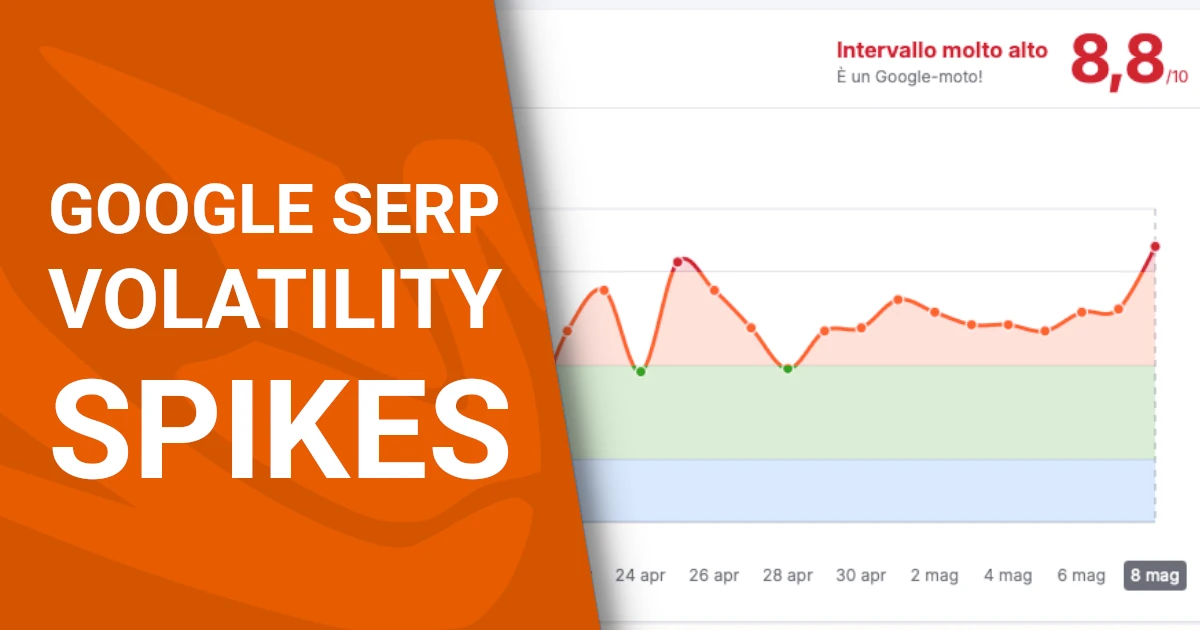
    A few years ago, SEO focused mainly on keywords, backlinks, and optimized text. Today, Google also considers user experience as a ranking factor. That’s why UX is now a core part of effective SEO strategies.

    If your website provides a great experience — intuitive navigation, fast loading, clear structure — users stay longer, engage more, and return. These are all positive signals for search engines.

    How UX boosts SEO (and vice versa)

    1. Core Web Vitals
      Google’s metrics that measure real-world user experience: speed, interactivity, visual stability.
      Example: A homepage that loads in under 2 seconds (LCP) is SEO-friendly.
      Optimize images, scripts, and CSS to improve performance.
    2. Clear structure and semantic hierarchy
      Good UX uses H1–H2–H3 tags, breadcrumbs, and readable URLs — all helpful for both users and Google bots.
    3. Mobile-first design
      Since 2018, Google uses mobile-first indexing. A responsive, mobile-optimized site is non-negotiable.
      Example: Hamburger menu, readable fonts, large touch targets.
    4. Lower bounce rate
      If users find what they need quickly, they stay — improving session duration and page depth, both SEO-friendly metrics.
    5. Readable and engaging content
      Good UX means short paragraphs, clear headings, visible CTAs — all making content more user-friendly and SEO-rewarded.

    Real-world example

    A company site had good content but poor layout, long blocks of text, and hidden CTAs. After UX improvements (layout, hierarchy, calls to action), average time on page increased by 70%, and Google rankings improvedsignificantly for target keywords.

    UX as an SEO driver: benefits

    • Higher organic search rankings
    • More qualified traffic
    • Lower bounce rates
    • More conversions, not just more visits

    UX and Social Media

    When we talk about User Experience (UX), we usually think of websites and apps — but social media platforms are digital environments where UX plays a critical role. Every interaction — from scrolling to liking, from tapping a link to submitting a form — should be smooth, intuitive, and consistent.

    A well-crafted social media UX increases engagement, reduces friction, and strengthens brand perception.

    Why UX matters in social media

    1. Users decide in seconds
      If a post is unclear or visually cluttered, they scroll past. UX focuses on visual hierarchy, readability, and clarity.
    2. Every click is precious
      The jump from a post to a landing page should be fast, frictionless, and error-free.
      Poor UX: broken links, non-mobile-friendly pages.
      Good UX: clean, tracked links that open responsive, relevant content.
    3. Cross-channel consistency
      The experience should feel seamless across Instagram, the website, email, and e-commerce. Users shouldn’t feel like they’re moving between disconnected platforms.
    4. Microinteractions and accessibility
      Reactions, animations, and carousels enhance UX only if they don’t distract and are accessible on mobile and with assistive tools.

    Real-life examples of strong social UX

    • Instagram: a brand with consistent reel covers and a clear CTA in the bio improves user flow and funnel progression.
    • Facebook: placing a visible “Shop Now” or “Learn More” button on posts makes conversion easier.
    • LinkedIn: a post formatted with spacing, emojis, and clear headings boosts readability and interaction.

    UX best practices for social media

    • Use readable visuals optimized for small screens
    • Avoid dense or long text blocks
    • Ensure post-link-landing page consistency
    • Test all links on mobile devices
    • Include clear, actionable CTAs

    UX and Email Marketing

    Email marketing is a powerful channel — but often overlooked from a User Experience (UX) perspective. A successful email must grab attention in seconds, be clear, readable, mobile-friendly, and guide users to a single, focused action.

    Effective UX in email improves open rates, click-through rates, and conversions, while reducing unsubscribes and spam complaints.

    Why UX matters in email

    1. Users decide in 2 seconds
      The subject line and preview text are critical. Poor UX here = delete or ignore.
    2. Quick visual scanning
      People don’t read, they scan. Use headlines, spacing, bullet points, and clear CTAs.
    3. Mobile-first design
      Over 70% of emails are opened on mobile. Use responsive layout, larger fonts, and tappable buttons.
    4. One clear CTA
      Focus on one primary action. Too many links = no action taken.

    UX-friendly email structure example

    <table style="max-width:600px;margin:auto;font-family:sans-serif;">
    <tr><td style="padding:20px;">
    <h1 style="font-size:24px;">Download our new free guide</h1>
    <p style="font-size:16px;">We created something valuable to help you improve your digital strategy.</p>
    <a href="https://yourcompany.com/guide"
    style="display:inline-block;background:#28A745;color:#fff;padding:12px 24px;
    text-decoration:none;border-radius:5px;margin-top:10px;">
    Download Now
    </a>
    </td></tr>
    </table>

    Email UX best practices

    • Keep subject lines short, clear, and human (under 50 characters)
    • Use single-column layout for simplicity
    • Ensure the CTA appears above the fold
    • Avoid text blocks: use bullets, headers, and visuals
    • Always test on mobile and in dark mode
    • Include a visible unsubscribe link for trust and compliance

    UX vs UI: what’s the difference?

    In digital design, the terms UX (User Experience) and UI (User Interface) are often confused or used interchangeably, but they refer to two distinct concepts — closely related but not the same.

    well-designed UI can attract users. A strong UX keeps them engaged and helps them achieve their goals.

    What is UX (User Experience)

    UX refers to the overall experience a user has while interacting with a digital product. It includes:

    • Navigation
    • Load time
    • Ease of finding information
    • Completing tasks
    • General satisfaction

    Example: A simple but fast checkout flow with no friction offers great UX, even if the design is minimal.

    What is UI (User Interface)

    UI is the visual and interactive layer through which the user interacts with the system. It includes:

    • Buttons
    • Colors
    • Typography
    • Spacing
    • Icons
    • Animations

    Example: An app with a clean layout, consistent icons, and well-sized buttons has a great UI.

    The key difference

    • UX is how it feels
      It’s about flow, emotion, clarity, and overall experience.
    • UI is what you see
      It’s about style, layout, and visual interactions.

    Simple metaphor

    Think of a car:

    • UI is the dashboard, steering wheel, and seat design.
    • UX is how it drives, how comfortable it feels, how easy it is to park.

    UX and UI must work together

    The best products are born when UX and UI collaborate:

    • beautiful UI with poor UX frustrates users.
    • great UX with bad UI feels unprofessional.

    The ideal is when the experience is smooth and the design is attractive.

    How to improve UX in practice

    Improving User Experience (UX) isn’t just about “making things prettier” — it’s about putting users at the center of every design decision. It’s a continuous process based on listening, analyzing, testing, and refining.

    There’s no one-size-fits-all, but there are universal steps every team can follow.

    1. Understand your users

    It all starts with research. You can’t design a good experience unless you know who your users are, what they want, and what frustrates them.

    Useful tools:

    • User interviews
    • Surveys (e.g. Google Forms, Typeform)
    • Empathy maps, personas

    2. Map the user journey

    Visualize the path users take from entering your site to completing a key action (purchase, contact, download).
    Identify pain points and obstacles.

    Useful tools:

    • Miro, Figma, UXPressia

    3. Build and test prototypes

    Don’t wait for full development. Build wireframes and interactive prototypes to gather early feedback.

    Tools:

    • Figma, Adobe XD, Marvel App

    4. Analyze real user data

    Use analytics to track actual user behavior, not assumptions.

    Tools:

    • Google Analytics (GA4)
    • Hotjar, Microsoft Clarity
    • A/B testing tools (Google Optimize, VWO)

    5. Remove friction and simplify

    Every extra click, every unnecessary form field, every slow page is a UX obstacle.

    Quick wins:

    • Shorter forms
    • Faster page load
    • Visible, action-driven CTAs

    6. Iterate continuously

    UX is not a one-time task. It’s a cyclical process of designing, testing, and improving.

    Recommended methods:

    • Design thinking
    • Agile UX
    • Continuous feedback loop

    Bottom line: UX as a business mindset

    Improving UX means improving business — because satisfied users are users who:

    • stay
    • engage
    • convert
    • return
    • recommend

    Need help optimizing your product’s User Experience?
    Dopstart offers a free initial consultation and can guide your company through the entire UX journey — from analysis to implementation and ongoing improvements. Reach out to discover what we can do for you!

    Improve your users’ experience

    Download our free User Experience checklist now — a practical tool to assess and optimize every stage of your digital project.
    Click here to get Dopstart’s free PDF.

    FAQ

    1. What is User Experience (UX)?
      It’s the overall experience a user has while interacting with a digital product.
    2. Why is UX important in digital marketing?
      Because it boosts conversions, retention, and user satisfaction.
    3. What’s the difference between UX and UI?
      UI is the visual layer, UX is the emotional and functional experience.
    4. How can I improve my website’s UX?
      Focus on navigation, speed, mobile design, and usability testing.
    5. What tools do UX designers use?
      Figma, Sketch, Adobe XD, Maze, Hotjar, Google Analytics.
    6. Is UX important for SEO?
      Yes, UX factors like speed and usability affect search rankings.
    7. Does UX apply to social media?
      Absolutely — it enhances engagement and brand perception.
    8. How does UX impact ecommerce?
      It increases sales and reduces cart abandonment.
    9. How is UX measured?
      Through both qualitative insights and quantitative data.
    10. How can I become a UX designer?
      Start with courses in research, design, and prototyping tools.
  • TikTok in trouble: €530 million fine for sending EU data to China

    TikTok in trouble: €530 million fine for sending EU data to China

    The platform is accused of illegally transferring users’ personal data outside Europe, in breach of GDPR

    The third-largest GDPR fine in history

    The Irish Data Protection Commission (DPC) has hit TikTok with a staggering €530 million fine, ranking it as the third-largest sanction ever issued under the General Data Protection Regulation (GDPR). Only Amazon (€746 million) and Meta-Facebook (€1.2 billion) have received higher penalties.

    At the core of the issue is the unauthorized transfer of EU users’ personal data to China, where parent company ByteDance is headquartered. The DPC determined that TikTok failed to comply with privacy obligations, exposing European data to significant risks.

    Why Ireland decides for all of Europe

    Under the GDPR, any non-EU company with its European base in a member state is subject to that country’s data authority. In TikTok’s case, its European headquarters in Ireland makes the DPC responsible for investigations and enforcement.

    The fine follows a lengthy investigation, which found that TikTok did not offer sufficient safeguards to protect data transferred outside the EU, putting users’ rights at risk.

    TikTok fights back: “We’ll appeal”

    TikTok strongly disagrees with the DPC’s decision and has announced plans to file an appeal. The platform argues that it has already updated its data practices to comply with European standards and called the fine disproportionate.

    Regardless of the outcome, the case sends a powerful message to big tech companies: if you operate in Europe, you must respect data protection laws — no matter where your servers are.

    Transferring Data Outside the EU: What the GDPR Says

    The General Data Protection Regulation (GDPR) restricts the transfer of personal data to countries outside the European Economic Area (EEA) unless those countries ensure an adequate level of data protection. In the absence of an adequacy decision by the European Commission, transfers can still occur if specific safeguards are in place, such as:

    • Standard Contractual Clauses (SCCs) approved by the European Commission
    • Binding Corporate Rules (BCRs) for intra-group data transfers
    • Data Protection Impact Assessments (DPIAs) to assess and mitigate risks
    • Participation in recognized data transfer frameworks, such as the EU-U.S. Data Privacy Framework

    In the TikTok case, the Irish Data Protection Commission found that the company transferred European users’ data to China without sufficient safeguards, breaching Articles 44 to 49 of the GDPR. Since China is not covered by an EU adequacy decision, companies transferring data there must take extra precautions.

    Implications for Businesses

    This record-high fine underscores how European data protection authorities are ramping up GDPR enforcement, particularly in cases involving:

    • Transparency in data processing
    • Protection of minors
    • Data security and localization

    To remain compliant, companies should:

    1. Map international data flows and identify high-risk transfers
    2. Assess the legal basis for each transfer and apply necessary safeguards
    3. Review contracts with vendors and partners outside the EEA
    4. Implement encryption, anonymization, and privacy-by-design measures
  • DolphinGemma: Google’s AI could let us talk to dolphins

    DolphinGemma: Google’s AI could let us talk to dolphins

    An interspecies communication breakthrough: Google develops an AI to decode dolphin vocalizations

    A voice from the deep: how dolphins might speak through AI

    DolphinGemma, Google’s ambitious new project, may become a turning point in how we understand animal communication. Created in collaboration with the Wild Dolphin Project (WDP), active since 1985, and the Georgia Institute of Technology, this innovation aims to decode and even generate dolphin vocalizations. The goal? To translate underwater sound into meaning and perhaps spark a real dialogue between humans and dolphins.

    The project focuses on a specific community: the wild Atlantic spotted dolphins of the Bahamas. Years of underwater field research have produced a large archive of audio and video recordings linked to individual dolphins, revealing patterns like the signature whistles used by mothers and calves to reunite. Now, with the help of artificial intelligence, scientists are setting their sights even higher.

    Inside DolphinGemma: high-performance audio AI

    At the heart of DolphinGemma lies a powerful audio AI model, based on Google’s SoundStream tokenizer, designed to process and understand complex sound sequences. The model, which includes around 400 million parameters, has been trained on WDP’s vast acoustic database, one of the world’s richest resources on cetacean communication.

    This AI technology can analyze the structure of dolphin vocalizationsdetect repeating patternspredict what sounds are likely to come next, and even generate new sounds that mimic real dolphin speech. It works similarly to language models for human communication, which anticipate words in a sentence—but this time, the aim is to build a shared vocabulary between species.

    Interactive conversations: the challenge of the Chat system

    Beyond decoding natural dolphin communication, the Wild Dolphin Project is also testing a bidirectional communication system for use in the ocean. This is where Chat (Cetacean Hearing Augmentation Telemetry)comes in—a submersible computer developed with Georgia Tech that emits synthetic whistles tied to objects dolphins enjoy, like sargassum or seagrass.

    The hope is that dolphins will associate these sounds with specific objects and begin to imitate the whistles to “ask” for them, opening the door to meaningful interaction between species. If successful, this experiment could lead to the first real semantic exchange between humans and marine mammals.

    An open source future for marine science

    Google plans to release DolphinGemma as open source software this summer, allowing scientists worldwide to access the model and apply it to other dolphin species, such as bottlenose dolphins or spinner dolphins. This move could significantly accelerate research in the field of interspecies communication.

    Ultimately, DolphinGemma is not just a technical feat—it’s a step toward empathy, connection, and mutual understanding between humans and the animal world. With its help, we might finally begin to understand the voices that have echoed through our oceans for millennia.

error: Content is protected !!
×