Category: Digital Marketing
Articles on Digital Marketing and Web Marketing. A selection of thoughts and theories on digital marketing.
-
How to Become a Digital Marketing Specialist: A Quick Guide
The other day, my eight-year-old son looked at me seriously and said, “When I grow up, I want to be a digital marketing specialist.” After a brief moment of pride (finally, someone in the house understands what I actually do all day on the computer!), I thought: “Wow, there’s hope that my child will follow…
Written by

-
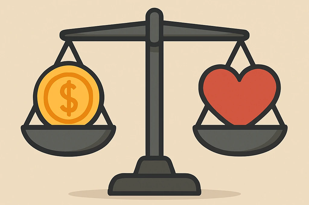
When marketing lies (or tells the truth): ethics wanted in the land of deception
Between broken promises, manipulative ads and increasingly disillusioned consumers: is ethics in marketing still possible, or just a beautiful illusion? Has marketing lost its soul? Once upon a time, marketing was about storytelling, creating value, building genuine relationships. But today, ethical marketing sounds almost like a contradiction. Deceptive ads, greenwashing, algorithms that play with our emotions, and personal data treated…
Written by
-
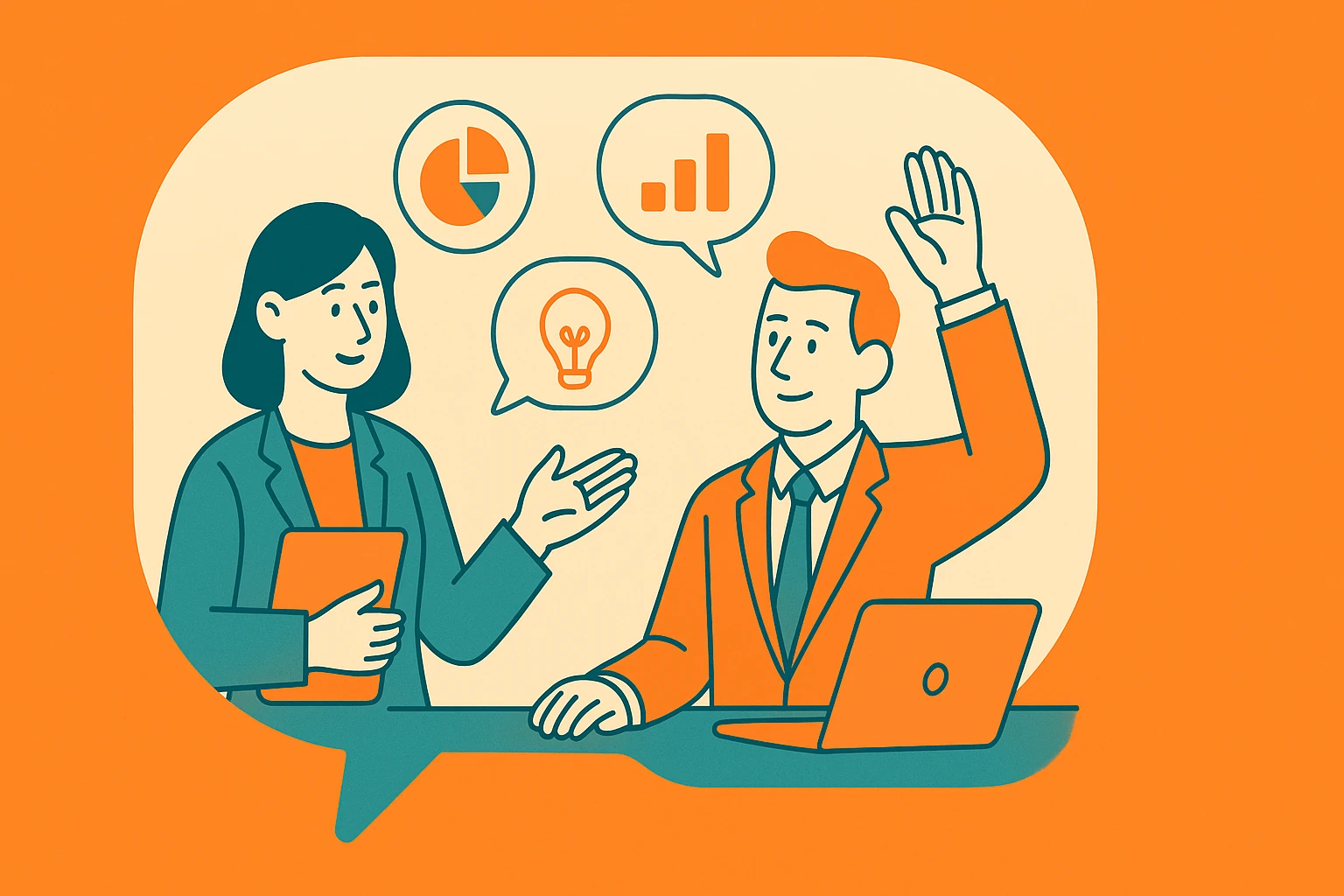
Marketing in the age of AI: the 5 questions everyone is asking
How digital marketing is changing with artificial intelligence: insights from Google’s GTM team on Search, YouTube, lead quality, and conversions
Written by
-
15 digital marketing ideas to grow your small business
Discover how to attract customers, boost visibility and build lasting relationships with simple but effective strategies
Written by

-
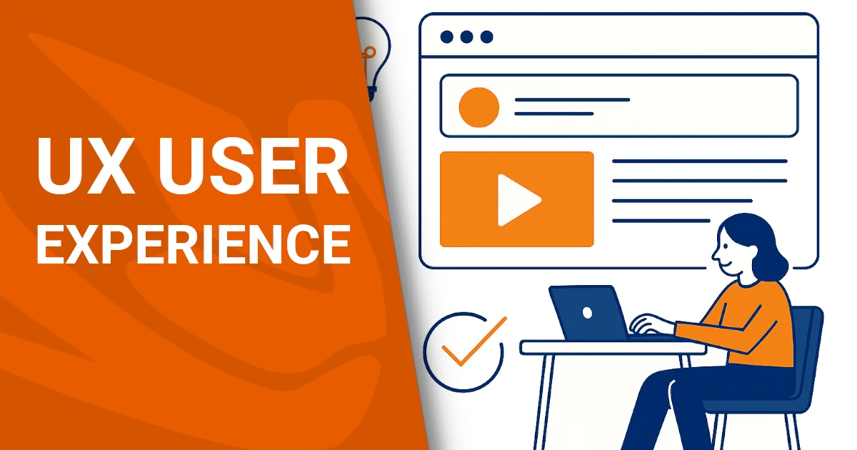
User Experience: the key to digital design
User Experience (UX) is one of the most crucial concepts in the modern digital world. Often confused with aesthetics or usability alone, it actually encompasses much more: it refers to the overall experience a user has when interacting with a website, app, or digital service. In this article, we’ll explore what it is, why it’s important,…
Written by
-
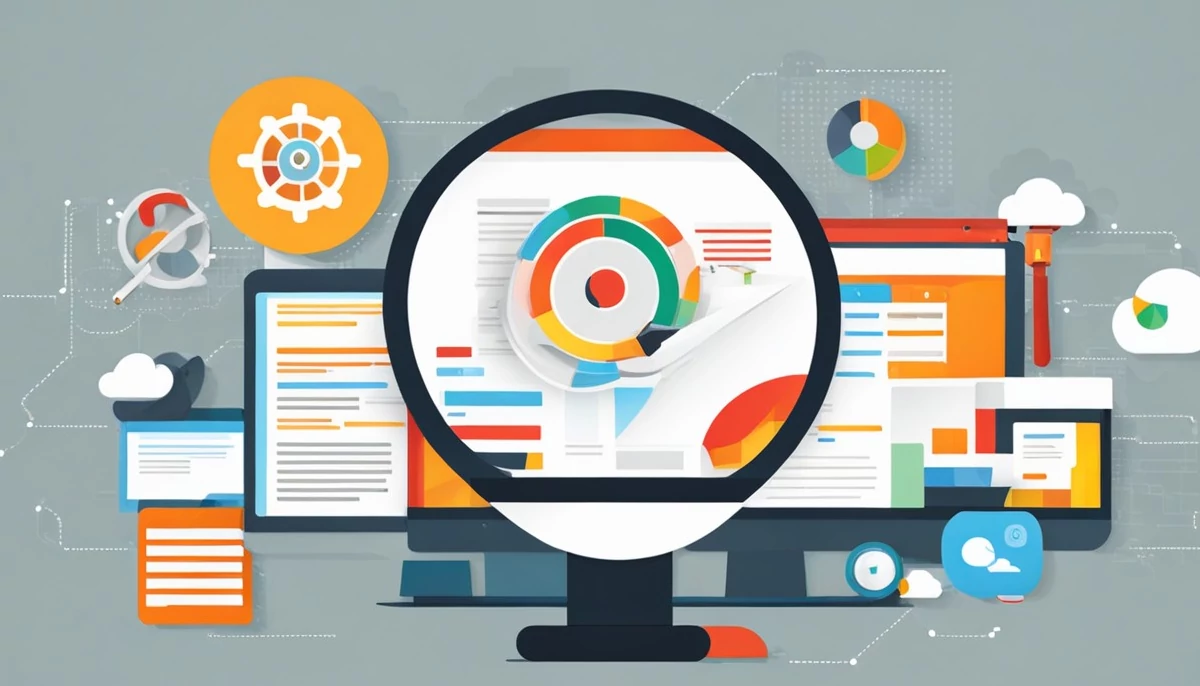
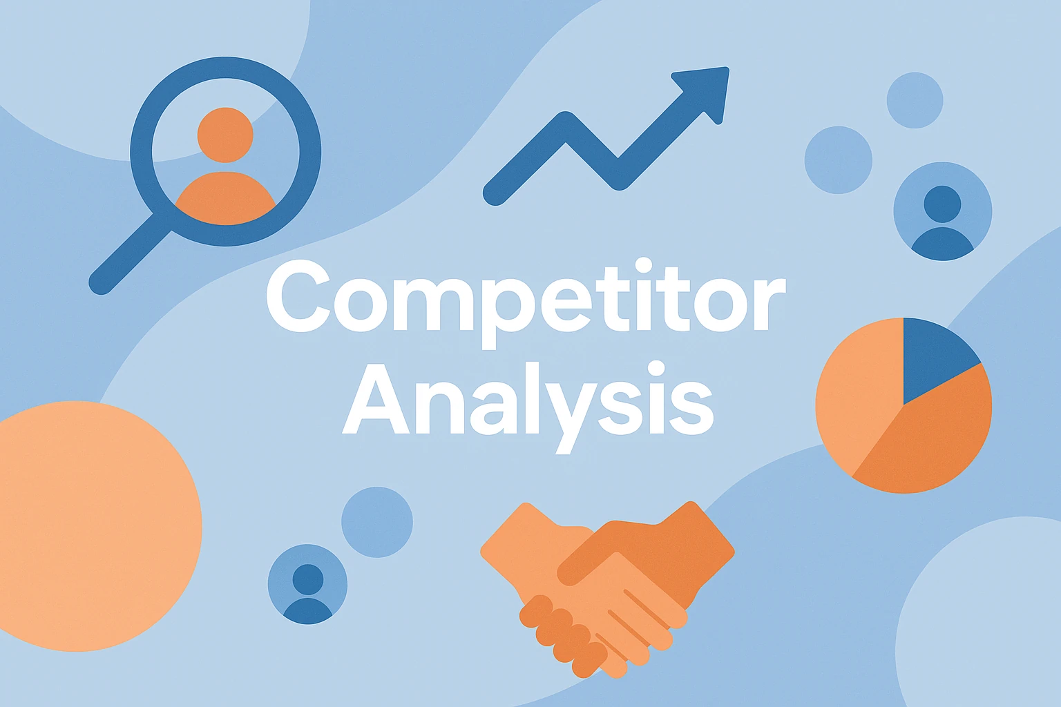
Competitor analysis in digital marketing
Understanding your rivals is key. This article explores the importance of competitor analysis in digital marketing, outlining strategies, tools, and differences from traditional marketing. You’ll also learn how to do a competitor analysis, what it’s for, and see a practical example to guide your next move. What is competitor analysis? Let’s start by defining what…
Written by
-
AI and consumers: How artificial intelligence is reshaping shopping behavior
Artificial intelligence is reshaping the way consumers search for information, make purchasing decisions, and interact with brands. Chatbots, virtual assistants, and AI-powered search engines are gaining ground, offering personalized experiences and reducing search times. However, challenges related to transparency, data security, and consumer trust remain. A recent study by the Italian Observatory for Electronic Commerce for SMEs (OICE), presented on January 28,…
Written by

-
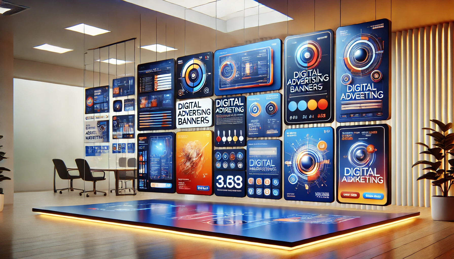
Web banners: what are online advertisements?
What is a web banner and why is it important? A web banner is a graphic format used to promote a product or service on a webpage. It is one of the most common tools in online advertising, integrated into campaigns to capture users’ attention. These visual spaces, often appearing in strategic spots on a…
Written by
-
Search Engine Marketing: definition and characteristics
The world of marketing is constantly evolving, and with the advent of digital technology, Search Engine Marketing (SEM) has become one of the most important components for online success. But what exactly is “Search Engine Marketing,” and what are its key characteristics? Search Engine Marketing: definition and characteristics Search engine marketing (abbreviated as SEM ) is one of the fundamental…
Written by