Category: Blog
-
Goodbye SEO-only, welcome GEO: How Google search is changing forever
Google transforms its search experience with AI: what you say matters more than how you say it
Written by

-
Download and get hacked: the silent malware hiding in Google results
Over 8,500 systems infected via fake PuTTY and WinSCP downloads in a global SEO poisoning campaign
Written by

-
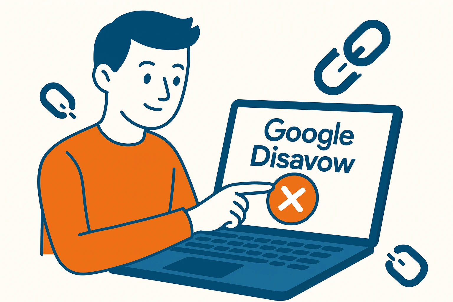
Google Disavow File: What It Is and How to Use It
Have you found suspicious backlinks that threaten your website?The Google Disavow Tool is the feature that allows you to protect your site from toxic links, spam, or negative SEO attacks. In this guide, you’ll learn how to create and submit a disavow file, when to use it, and why it can make a significant difference in your search engine rankings.…
Written by
-
How to upload photos to Google reviews
Leaving a review on Google is a simple yet powerful gesture: it helps others make better choices and gives visibility to deserving businesses. But adding a photo to your Google review? That’s even more effective. In this article, you’ll learn how to upload images to Google reviews, why it’s worth doing, and what to watch out for to avoid…
Written by

-
Google vs publishers: AI Overviews ignite antitrust clash in Europe
A group of independent publishers files a complaint against Google over AI-generated summaries that allegedly hurt news websites
Written by

-
15 digital marketing ideas to grow your small business
Discover how to attract customers, boost visibility and build lasting relationships with simple but effective strategies
Written by

-
Google releases June 2025 core update
What’s changing in SEO rankings, search traffic and visibility?
Written by

-
TikTok in 2025: why brands can’t afford to ignore it
Viral marketing, AI and live shopping: TikTok is the new digital shopping mall
Written by

-
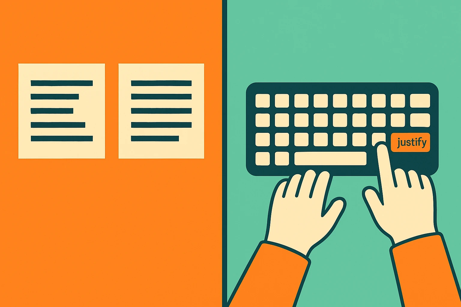
Justify text in WordPress
Do you want justified text in WordPress but the option seems gone? In this video tutorial my favorite method. In the article you will find other alternative solutions.
Written by