Category: Blog
-
Competitor analysis in digital marketing
Understanding your rivals is key. This article explores the importance of competitor analysis in digital marketing, outlining strategies, tools, and differences from traditional marketing. You’ll also learn how to do a competitor analysis, what it’s for, and see a practical example to guide your next move. What is competitor analysis? Let’s start by defining what…
Written by

-
Connecting Blogger to Google Search Console
Google Search Console is an essential tool for monitoring and optimizing your site’s visibility in Google’s search results. If you have a blog on Google Blogger and want to connect it to Google Search Console, it’s important to set up the connection correctly to take advantage of all the platform’s features. This article will guide…
Written by

-
SEO for Blogger: complete guide
Our SEO Agency rarely has requests to optimize sites made with Google Blogger. However, it has happened that some clients have made a personal blog and asked for some suggestions for SEO optimization. It is our pleasure to share the advice that we usually give in these cases. In this article, you’ll learn how to…
Written by

-
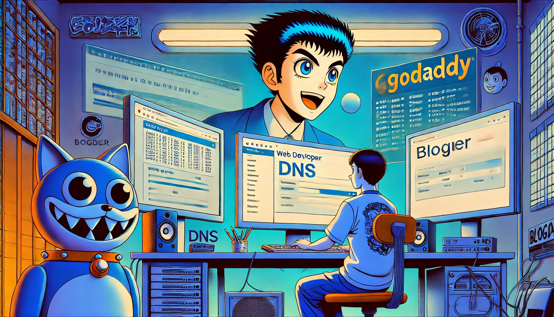
Domain Problem Blogger Godaddy Without www
We have received several reports of problems with the Godaddy domain connected to Blogger. In this article we will see how to solve the problems between domain with www and without www on Blogger and GoDaddy in a simple and definitive way. Introduction One of the most common problems for people connecting a custom domain…
Written by
-
Blocking the Semrush Bot: Why and How to Do It
A client of ours to whom we provide SEO services has specifically asked to use a certain suite of programs for SEO analysis. However, Semrush is not among them. He also noticed in the file Logs that the Semrush bit punctually returns to show itself, a sign that his competitors study it. The shared decision…
Written by

-
Typosquatting: what it is and how to prevent
Abstract Typosquatting is a pervasive threat in the digital landscape, exploiting simple errori di ortografia to deceive users and compromise sicurezza informatica (cybersecurity). By understanding cos’è il typosquatting and implementing preventive measures, both individuals and businesses can protect themselves from this insidious practice. Stay vigilant, double-check URLs, and leverage security tools to ensure a safer…
Written by

-
Google reCAPTCHA Evolves: Mandatory Migration by 2025
Unification Under Google Cloud for Advanced Security and Simplified Management Introduction: A Necessary Change Google has announced that all reCAPTCHA keys must be migrated to a Google Cloud project by the end of 2025. This move will unify all reCAPTCHA customers under a single set of terms and a consistent pricing structure, while providing access to advanced security features. If you…
Written by

-
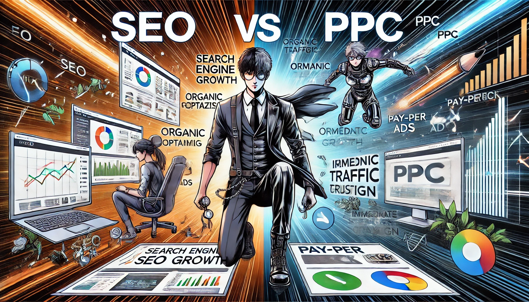
SEO vs. PPC: which strategy is best for your business?
Digital marketing offers multiple ways to improve online visibility and attract customers. Among the most commonly used strategies are SEO (Search Engine Optimization) and PPC (Pay-Per-Click). But which one should you choose? Dopstart, specialized in SEO consulting, helps businesses identify the best strategy, offering a free initial consultationand guiding them through the entire process until useful results are obtained. SEO: improving website visibility…
Written by
-
Search Intent: User intent that is useful for SEO
Search Intent is one of the most important aspects to consider when optimizing a website for search engines . Understanding Search Intent is crucial to ensuring that your site content is relevant to users and meets their needs. In this article, we will explore what Search Intent is and why it is so important for SEO. What is Search Intent?…
Written by